ESSAYS & REVIEWS
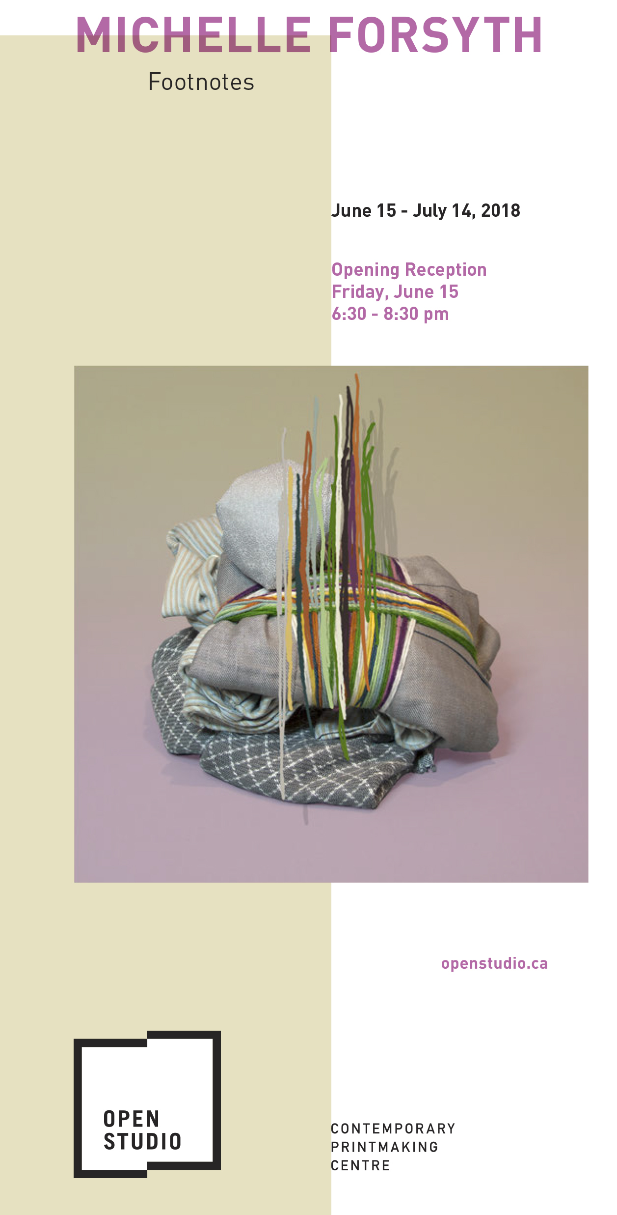
MICHELLE FORSYTH: FOOTNOTES
Exhibition Brochure
Open Studio
FOOTNOTES - MICHELLE FORSYTH
Text by Jenn Law
[+ Read ]
'Like' and 'like' and 'like' – but what is the thing that lies beneath the semblance of the thing?[1]
--Virginia Woolf, The Waves
When artist Michelle Forsyth was six years old, she had to sell most of her belongings when her parents decided to move to a sailboat. She had a bunk, one shelf for her remaining possessions, and a single drawer for her clothes. Their family lived on the boat for six years, moored in a British Columbia marina during the school year, and setting sail on various adventures in the summer months. It was a formative experience that has shaped the artist’s relationship to material things and her concept of home. If objects create a sense of being at home in the world, reflecting us back to ourselves, then, as Martin Heidegger tells it, the experience of being unhoused inevitably evokes angst in the individual.[2] In this, “what remains is a subject whose objects have abandoned it.”[3] To the artist, however, such angst is productive, even necessary – allowing her to see the world as it truly is, in order to open up new possibilities.
Home is the starting point for Footnotes, both literally and conceptually. Forsyth’s current abode, a compact basement apartment in Toronto, functions as a fluid live/work space. To visit is to enter a domestic archive, everything methodically curated and displayed. Forsyth’s space is full without feeling claustrophobic, as she takes great care to ensure that everything may be seamlessly tucked away. Things are routinely arranged and rearranged, wrapped and unwrapped, and occasionally given away. In the artist’s collection, every object is relevant. Home, for Forsyth, is not a fixed place in time and space; it is a process in the constant throes of reinvention.
The impulse to make work from her surroundings was fortified when Forsyth was first diagnosed with Parkinson’s disease in 2009. That year, she decided to focus on what was going on immediately around her, rather than responding to external social issues.[4] Ultimately, however, the artist’s work moves beyond a mere concern with the domestic sphere, probing deeper ontological questions concerning what it is to exist in the world. Forsyth’s first body of work from this period consisted of paintings of her then-husband’s plaid shirts. Mimetic exercises in abstraction and repetition, these works are studies in intimacy and loss, each shirt copied and distilled to its essential formal elements, marking a desire to create meaning through pattern in an indexical way. Forsyth employs wide-ranging strategies of copying in her practice. Over time, her work has evolved into sumptuous, trompe l’oeil creations, layering multiple objects and processes into carefully staged compositions.
In Footnotes, each piece begins as a sculptural assemblage composed of individually hand-crafted copies created through diverse means, including hand-woven textiles, lithographs, silkscreens, paintings, papier maché, and textual anecdotes. Through the variable copy, the artist reiterates the object’s originality over and over. Its singularity is amplified in being reproduced, not diminished or subsumed. Each copy represents a close reading of the object, a focused exercise in understanding. Learning new mimetic processes has become, for Forsyth, a means of accessing the object from varied perspectives and coming to know it through multiple points of re-inception.
Though the final versions are presented as photographs, photography is merely the concluding act in an elaborate production. Forsyth edits the final layered image, adding in false backgrounds or shadows and screenprinting on top of the photograph in order to play with dimensionality and manipulate the viewer’s perception of proximity/distance. Consciously employed as both a conceptual and technical method of flattening the image plane, photography is a mediating tool, allowing the artist to push the opticality of the image while simultaneously creating a further layer of separation between the viewer and the work.
This photographic veil likewise obscures the evidence of the artist’s hand embedded within the image. Yet, the body and its labour remain central to these pieces. Several of the cloth bundles are dresses hand-made by the artist, many of which she can no longer wear as Parkinson’s takes its toll on her body. Other bundles are made from clothing gifted to the artist by friends. Often the only clues to their original corporeal functions are found in anecdotal texts accompanying the work. In more recent pieces, Forsyth references the body more overtly. In Old Jokes (2017), for example, a hole is cut into a painting through which a hand-sewn plaid glove reaches out, filled with the artist’s hand grasping a crumpled plaid paper bundle.
Many of the bundles contain hidden messages tucked deep within their cores like secrets. Forsyth similarly wraps and unwraps personal items in her home – childhood photographs, books, and other items of personal value. There are some things so precious, so vibrant to behold, that we must turn away our gaze. It is a quality, of course, not inherent to the things themselves, but the access those things grant us to some part of ourselves and our history that may otherwise remain inaccessible. The object here simultaneously functions as corporeal weapon and wound, recalling Joseph Beuys’ 1979 sculpture of a knife bound in gauze, When you cut your finger, bandage the knife.
In the language of still life, the body itself becomes a thing among things. For Forsyth, this work in part bears witness to the struggles of the body; the labour invested in its meticulous making, a triumph over the disease.[5] As Elaine Scarry writes, “what is quite literally at stake in the body in pain, is the making and unmaking of the world.”[6] While Parkinson’s does not define Forsyth’s work, it informs her practice in intimate ways that remain largely invisible to the viewer.
“’Like’ and ‘like’ and ‘like’,”[7] writes Virginia Woolf, but can we ever dig deep enough beneath the simulacra of the thing to reach its essence? The thing can never speak to the full profundity and mystery of human experience, to its joys and its suffering. Yet it can serve as a footnote to a life unfolding, filling out and embellishing its hidden depths in ornate, spectacular detail. In the end, perhaps, semblance is enough, for it is here, in the material enchantment of likeness and affinity, that sympathy is revealed. Home, after all, is repetition.
[1] Woolf, Virginia. The Waves. Oxford: Oxford University Press, 2015, 95.
[2] Refer to Schwenger, Peter. The Tears of Things: Melancholy and Physical Objects. Minneapolis and London: University of Minnesota Press, 2006, 69-70.
[3] Schwenger, The Tears of Things, 69.
[4] Forsyth, Michelle. Interview with Jenn Law, February 21st, 2018.
[5] Forsyth, Interview with Jenn Law.
[6] Scarry, Elaine. The Body in Pain: The Making and Unmaking of the World. Oxford: Oxford University Press, 1985, 23.
[7] Woolf, The Waves, 95.
INTERVIEW
Conducted by Irina Tomshinsky, a 4th year Criticism and Curatorial Practice student at OCAD University. The following interview was for a class titled: Proseminar: Curators & Critic taught by Paulette Phillips.
[+ Read ]
IT: Could you briefly talk about your university experience and what was your practice like, back then? What were your interests? Did you have a preferred medium to work with?
MF: I went to the University of Victoria and studied photography and sculpture, even though I made paintings. I went to Graduate School at Rutgers. When I was a grad student I was a figurative painter at that time, so I went to study with Hanneline Rogeberg and Joan Semmel. Overall, my education experience was excellent. I wouldn’t have changed it. My undergrad program was very conceptual, so we didn’t do any traditional drawing. And my grad degree is in interdisciplinary media.
IT: Now that you are a professor yourself, do you feel that the student experience changed and how is it different from back then?
MF: Well, obviously the Internet is around. When I was an undergrad there was no Internet or, it was just starting up. I didn’t have an email either at that time. I think I got my first email in 1997, and I graduated in 1996. So when I was a student I was typing up papers on a Smith-Corona word processor, and I would have to adjust every line, so it was quite different. We didn’t have a computer lab in the Fine Arts building, we had to go and use the computers in Art History. So there were no digital manipulation of images or anything like that.
IT: Do you think that this is why your practice is so hands on?
MF: Not because of that. But it’s hands on because I grew up in a family where my mother made everything. She made all our toys and clothes; even our board games were made from cardboard. So, I grew up making everything.
IT: When you start new projects, what is your process like? How do you get inspired and get your ideas?
MF: It’s interesting that you say, “start new projects” because I don’t think of myself as starting new projects but just always continuing the past ones and they morph and change into the new thing. I have new ideas…
IT: How do you come up with those?
MF: I have so many ideas I couldn’t make enough work to explore them all.
IT: Do you have any particular sources of inspiration that you draw from?
MF: Nest Magazine, Interior design, color, fashion, the home. I don’t really read art magazines, but I read design magazines. And Pinterest, I use Pinterest a lot. It’s my digital sketchbook.
IT: As I was browsing through your website, I noticed a common trace in your works, all of them in one way or another have a grid. Is that something you can comment on?
MF: When I was an undergrad, I did everything on the grid and my professor Mowry Baden always told me to get away from the grid. And Jessica Stockholder who studied with Mowry Baden early on said: “don’t listen to things that your professors say take your own path.” So I use the grid a lot. I feel like the grid is this point where the Matrix of craft meets the matrix of digital and it’s also a way that we use in painting to transfer images. And weaving too, weaving is based on the grid.
IT: I also noticed that all your projects are very meticulous in their execution and almost obsessive in their fabrication. It can be seen right away that a large amount of work is invested in them. Nowadays, in university, instructors often tell us to find ways to simplify the process and find faster and more convenient ways to execute the work. In your practice it appears to me that you do just the opposite, can you comment on that?
MF: It is an interesting thing that you say that. Because when I was a student, professors said the same thing to me and I always did the opposite of what I was told. Because it was more interesting than simplifying the process, simplifying the idea, and my ideas are pretty complex. I don’t want to create a one liner with my work, we don’t think that way and we don’t communicate that way and our minds switches gears all the time, so I like to put all of that into the work.
IT: Don’t you occasionally find it frustrating when you have such a large amount of work to execute?
MF: No, I don’t. I have works that I’ve been making for years and years. It doesn’t bother me because I have so many projects on the go. I have more than thirty things going on at a time. And so, people say it looks like I’m really productive but I just have been working on all of it for so long that when projects finally get finished it looks like I have done a lot.
IT: Do you set timelines for yourself?
MF: I set goals. And they are more general and vague and not related to one piece or another because I don’t like to rush my work. I find the working on the work, the most important part. In fact when it leaves the studio I feel a bit sad because it somehow looses something when it’s divorced from the context of the place where it was made.
IT: Do you think that is why you work in series?
MF: I just get an idea and explore it for a while. I want to think about all my series as being one body of work. There is a book titled The Plague by Albert Camus and in it is a character named Grand who is working on his masterpiece, which is a single sentence, repeated in different ways. And I think of that in a similar way to how I work. If the painting didn’t work, I will try again and try again. I feel that in a sense all my works are the same work I’m just trying t get there and I never do.
IT: Do you think you will eventually get there or is all about the process?
MF: Well, I hope so at the end of my life. If I got there then there wouldn’t be anything to work for.
IT: Another thing I noticed is that you love plaid? Is there a reason?
MF: When I was married, my husband went on sabbatical and that’s when I started painting plaids. I started painting the reproductions of all his shirts that he left in his closet. It actually started out when I was thinking about this book titled
Microserfs by Douglas Coupland. In it there is a group of people who are writing code on a video program based on Lego. One character locks the door and works really hard on the code; he stays in there for a few days. His friends were getting nervous that he wasn’t eating so they bought him flat food and pushed the food underneath the crack in the door. So, I though instead of going out into the world doing work about other places, what happens when you are closer to home and close the door. I also wanted to work in the studio as if I needed flat food because if I worked hard enough to need flat food then I was really onto something.
IT: Are you at all interested in creating displays for your work? You have works that are displayed on the wall using needles and some that have pedestals and also sculptural works that are inspired by those pedestals.
MF: I am interested in display but more than that I am interested in rupturing our expectations of what we want to see, is it a photograph or is it a painting would be the question that comes up most often in my work. But also, what is ok to make right now and what is not ok, what if we tried out some of the modalities of work that are not in fashion. And thinking about displaying all of those works together that have all those counterpoints that meet but also try to mess with it a little bit.
IT: When you say what is ok to make and what is not ok to make can you elaborate on that?
MF: I’ve read this article recently called “like art” about Instagram. You get all the likes but how much work is being made to be or, somehow comes across on that media online, that is likable and what is not likable it is something I think about. Figurative painting and autobiographical work is not necessarily in vogue right now. So I’m interested in exploring that space.
IT: Speaking of autobiographical work, as far as I know, you are working on a memoir right now. Can you talk about that?
MF: Well the memoir started because--if you noticed all the works have text that goes with them--so the text and the image were always at odds with one another. With painting you don’t necessarily anticipate to have a text block to go with it, where with photography you do see that often. Because people wouldn’t know that there was text so I thought maybe I’ll get rid of the images because, I’m good at images and play with that text for a while to see where it goes without the image. But then I started bringing images back into the text again.
IT: I did notice that there are small illustrations that accompany the text. How would those be incorporated?
MF: I have a book that I had as a kid in the 80’s, it is a home decorating book and I’m laying out the whole memoir in that style. So the home decorating book becomes a place where the line drawings that mimic the line drawings of the history of furniture that are in the original book. And the book comes up in the narrative about my life that’s the place where I start. I met Richard Hunt who teaches graphic design and showed him some early designs and he suggested I respond to something I know so that was influenced by him.
IT: You have work that deals with trauma in particular, where you photograph the site of catastrophes and the photos not necessarily portray the wreckage of the disaster but other subjects in the area. How do you pick those images you choose to work with?
MF: For those I actually travelled to the site and documented hundreds of photographs from the site. When I got back to the studio I picked the ones that I thought were the most poetic. I use intuition in the studio a lot. I consider it a version of play. And I feel if we don’t allow ourselves to play then what are we doing? Because play for me is very important in my work. I used to make work that was very serious and then, I had to do these goals for my job. Every year we had to submit our goals. And all my goals were goals about advancing etc. And when I got diagnosed with Parkinson’s I wrote my goal and it was only one sentence. My goal was not to have any goals. I realised that nobody read it because the response was the same as the year before and that’s when I decided I will go into the studio shut the door and make what I want t make. And if I change my mind and want to make something else on the next day, I wont feel bad about it. I’ve since started writing goals again though.
IT: How do you deal with storage?
MF: I don’t believe in having a storage outside of my place and I think its because I grew up on a boat and we came up with ingenious ways to store everything. I have everything stored in the cupboards in my studio, bedroom I have things in cardboard boxes and bins. I’m really organized. I made a pedestal system that I’m still working on where you can put it together and take it apart like Lego to circumvent the storage problem.
IT: You mentioned that you grew up on a boat is that where your need for organization comes from. And is that why you are drawn to grids to figure out where to place things?
MF: Yes, I wrote my graduate thesis about that.
IT: You work in a lot of mediums; do you have a preferred medium that you are more comfortable with?
MF: I think, I’m most comfortable with painting. I often distrust painting. It’s a love/hate relationship. I think that painting is a lie by its nature. You are putting colour pigment on the surface to create fiction all the time. They are constructions. But painting also records the mark of your body, which I am excited about. I’m actually getting more excited about performance. Not performance in the typical way that you would think. But in the sense that every time you make a piece of art you are performing. I am trying to find a place to unveil that in my work is something I’m interested in looking into.
IT: Are you interested in displaying the process of making the artwork as an artwork?
MF: An artwork that built from process displays that naturally. I think because I have difficulty doing simple tasks like getting dressed., doing up zippers knitting, and doing things I used to do really fluidly. The process of making work becomes now more important because it is more of a physical feat to do the stuff that I used to do.
IT: Does that make you readjust the way you work or do you continue to use the same process but have to put more effort into it?
MF: Yes, the second one. I think about the turtle that won the race just keep gong slow and you’ll get results. You just have to put in more time.
IT: With your work being so meticulous and time consuming aren’t you tempted sometimes to find an easier way?
M.F: When I was an undergrad, I made paintings really fast. I made a painting in a day. And then I realized that as an undergrad you don’t have that opportunity to spend a year on a painting because, if you spent a year on a panting and it failed you’d fail your painting class. So when I finished my undergrad, one of my strongest desires was to make a painting that took along time to make. And then I started doing that, spending time on work. I thought it was a lot of time, at the time, but now I feel that I still made fast paintings.
IT: In some of your works you use certain patterns to paint, is that something you do digitally?
MF: No it’s analog. I used screen-print overtop watercolours but before that I was using transfer paper to transfer those lines. In a sense it was a way to make handmade pixels. It came out of the fact that I hated washing brushes and I worked with oil paints and so I thought if I just use small brushes then I don’t have to wash them very well. Then I started to use those tiny brushes to make my paintings and build them out of lots of marks. I started organising the marks more like a digital skin. Because all those images earlier came from the web I wanted to slow them down. In graduate school I was making those huge paintings. Then when I finished I didn’t have a studio and thought I’m going to make those little petty points where every pixel is hand stitched.
IT: Those are very beautiful.
MF: But it’s horrific too, since this is a car accident victim and his face is all torn off. So I was taking those horrific images from the web and stitching them up to appear beautiful.
IT: Why were you drawn to such imagery?
MF: I wanted to take these images that we see everyday. They are so ubiquitous, we see them really fast and I wanted to slow them way down. To take fast images and make them slow through process. And this is where I was thinking about this grid as the matrix of craft meets digital. But I also like to use technology to slow my process down rather than speed it up. For example: all of the drawings in my book are made with illustrator and not by hand.
IT: I would assume you aren’t using a tablet.
MF: No, I use the track pad on my laptop.
IT: I’m trying to understand the reason as to why you are trying to slow things down so much?
MF: To give me time to think. When you sit there and knot a sweater, that kind of slowness allows for so many things to go through your head.
IT: We had a talk in class where one of the guests said that, it is a generational thing where nowadays students have a shorter attention span and need things to be more dynamic.
MF: Do you think that’s true? I don’t like those generalizations between generations. Because, how do I know what your experience is like? And how do you know what mine is like?
IT: I guess a lot of people will have a difficulty grasping why you are trying to slow your process down when so many are trying to accelerate theirs.
MF: Well, why are we making things so quickly?
IT: I guess, some people try to make more room for other projects but as you said, you work on yours simultaneously. And others are producing works to meet deadlines.
MF: I don’t have that pressure because I have a teaching job. And I don’t have a dealer right now. I had a dealer before in New York and I was always making work for art fairs. You have deadlines where you need to have a certain amount of works for this or that art fair. But I really enjoy the fact that I can make works at my own pace. Because when I was younger I always had an interest in getting into this show or that show but now I’m interested in putting my work out in the Toronto art scene. Because a lot of people don’t know my work but its more of a conversation rather than checking shows off my list. Because I had a lot of shows and I don’t need to have more shows unless it’s interesting to me.
IT: So it’s quality over quantity?
MF: It’s more like if I can discover something by showing it then I’m interested. I have a show coming up in June with Colette Laliberté at a little storefront space that a friend of mine has and I’m exploring my props that I use in my works. I’m making little individual shelves for them. And the shelves have painted shadows on them that are painted just like the objects. I’m getting really interested in these shelves as a site for painting. I’m trying to make the work do something as interesting as it does in my home. Because, when it’s in my home and I take it out and I set it somewhere it has a relationship to the things around it. For example, the little watercolour on the wall is a watercolour of the larger painting next to it. And its more interesting seeing it on the wall besides that big painting than it would be separate from it. I am trying to figure out how you can get that kind of conversation to happen in a galley and I think that it’s impossible. That’s why I like showing in stores or other spaces that aren’t necessarily galleries. And that’s where I’d like to show more of my work.
IT: So you are trying to move away from the white cube to maintain the “hominess” and relationship?
M.F: I’ve been working in this home for four years now and I like what is happening with the work when it is in the home. And I don’t think that I’m trying to maintain that yet, but I just enjoy the work in the home more than outside of it. The work is different in the gallery, it becomes isolated like jewel. I call it “a jewel on a wall” where as the same piece is at home it’s like a “needle in a haystack”. And I like the needle in a haystack more than the jewel on the wall.
IT: is that because it allows you to look for the works and discover them as opposed being presented with the work?
MF: I don’t know because that is the perspective of the viewer who encounters this. But I live with those works all the time. Every pattern in my work comes from an article of my clothing. There are multiple conversations happening in the home between the objects and my stuff. And where does your stuff end and work start? I’m interested in blurring that line. When you have a stacked two items sitting on a shelf or on your table, is that as viable as when you stack two items and take a photograph of it? Those are the kind of questions I like to ask myself.
IT: There are a lot of floral motifs in your works is there a reason for that?
MF: This is a bit of an older concern but the flower motifs that are in my work now are because they are in my clothing. Before I used a lot of flowers because I was making pieces that I saw as memorials. And flowers are often left on memorial sites. When I started the one hundred drawings project. The first site that I documented had plastic flowers on a grave. So that kind of impulse to beautify something that’s horrific I think that that’s where it started. But now the flowers in the work I choose floral clothing its more of a reference to my earlier work.
IT: What inspired you to become an artist? Did you always want to be a part of this world?
MF: I always wanted to be creative. My sister and I grew up on a boat we had no toys we just had boxes we kept at the end of our bed that we called our “busy boxes” and they just had pencil and paper in them. And colouring books and we would just draw for fun together. When other kids might have played with Lego or computer games we just had drawing contests. Now my sister is a painter too, we both came from that creative place.
IT: Is there any relationship between your and your sister’s work?
MF: there are times when we share ideas, but not intentionally. We don’t talk that often because she lives in Edmonton but when we do chat together we realize that we have often been interested in simmilar things.
IT: So to wrap things up, can you talk about any upcoming shows any future plans?
We did talk about your memoir so what else is happening?
MF: I have a show with Colette Laliberté in June; I will have a piece in the vitrines at The Harbor Front and that’ll open on June 24th. I have a solo show in the main space at Open Studio in January. And then I am working on a show in Hawaii for next spring. And I am still looking for funding for my book because it is an expensive project.
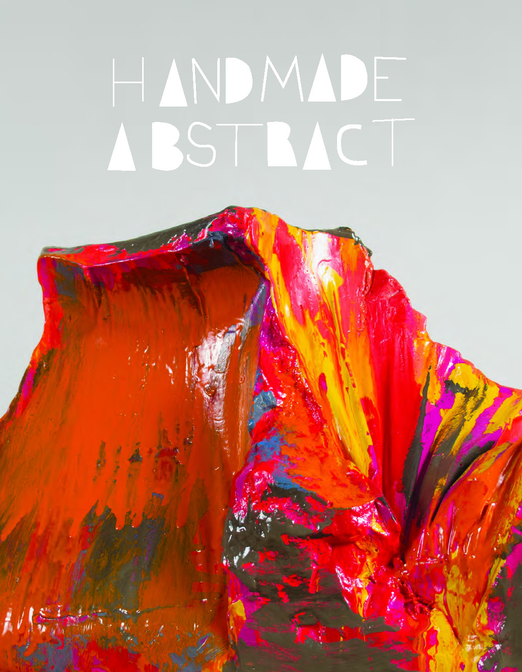
HANDMADE ABSTRACT
Exhibition Catalog
Artists include: Katie Bell , Maria Chavez, Michelle Forsyth, Carl E. Hazlewood, LoVid, Marisa Manso , Lael Marshal, Christian Maychack, Leeza Meksin, Liz Nielsen, Courtney Puckett, Mary Schwab, and Lizzie Scott
HANDMADE ABSTRACT
Text by Elizabeth Ferrer
[+ Read ]
There is no abstract art. You always have to begin with something. - Pablo Picasso
Handmade Abstract presents the work of 13 artists who give new relevance to abstract modes of creation. Pursuing a range of formats including sculpture, video, photography, installation, mixed-media constructions, and sound, these artists employ materials and fabrica-tion techniques that contextualize their work in relation to everyday, physical realities. Tellingly, only a single artist in this exhibition pursues painting on canvas, although many other artists represented here demonstrate a deep consciousness of painting and its modern history. Earlier generations of artists, beginning in the first decades of the twentieth century, saw abstraction as a pursuit set apart from (or transcending) representational art and quotidian subject matter. And working with this mode, they articulated varied intents, whether in their work or by way of impassioned manifestos: To eliminate per-spective and spatial depth, meaning that the artwork was no longer a “window” to another world, but a thing in and of itself. To evoke the spiritual or the universal. To spontaneously express pure emotion. To pare down visual elements to a core essence. The artists taking part in Handmade Abstract bring forth a new goal, to affirm abstraction as an inescapable presence in the world around us, and these artists’ works are meant to reflect or interpret a world close at hand. Abstraction is everywhere, whether at home, in clothing patterns, in our technology, shipping boxes, construction material, even in the sounds around us. The personal and the mundane become filters, departure points for art works made with a sense of openness and improvisational free-dom, unconventional materials and processes, and a fine disregard for old hierarchies and boundaries between disciplines.
Many of the artists in Handmade Abstract work with found, often cast-off or recycled materials, eschewing traditional artistic media. Common materials and quirky process provide rich layers of evoca-tions — with the history of materials and their associations with our personal histories, with construction and craft techniques that speak to manual labor and domestic craft, and indeed, with the history of abstract art itself. For her wall-based works, Lael Marshall stretches dishtowels, handkerchiefs, and other fabrics over handmade, irregu-larly shaped stretchers. These intimately scaled works clearly refer to domesticity (a theme referenced by several artists in the exhibition), but also, to a kind of eccentric minimalism that reveals the essential qualities of her materials — their color and pattern, tautness or elas-ticity, and translucency. Marisa Manso’s installations include office cubicles, lighting fixtures, and electrical wiring, materials that play dual roles in her works. The lighting fixtures (often found in garages or offices), act as both illumination and as formal elements; wires play a functional role while also offering a linear element, extending the work over the expanse of a wall. And the cubicles act as either visual support or as demarcation of a space, one that recalls white-collar labor, a decidedly different relationship to the handmade. Katie Bell constructs wall-based works out of construction detritus, transform-ing the color, texture, and shape of these elements into energetic
compositions that simultaneously inhabit and create space. Sculptor Mary Schwab bases her work on used, cardboard shipping boxes. She gives dimensional shape to the void, the empty space inside the boxes, by casting with Hydrocal, a substance that also registers the irregular surfaces and textures of bubble wrap or other wrapping materials left inside the boxes. Schwab sees these as hybrid forms, both sculptures and surfaces for painting. And once she paints these forms, they attain a bright hue and viscous sheen as well as a person-ality — they are abstract and yet strangely familiar.
Although none of the artists here pursue perhaps the most typical form of abstraction, pure painting on canvas, many speak of their work as an alternative to painting; the expanse of wall or the space their works inhabit as ground, and their materials as source of line, gesture, color, and texture. Carl E. Hazlewood works with a range of materials including colored paper, cord, tape, felt, and other fabrics, materials transformed into formal elements in assemblages that he constructs directly onto the wall. Originally a painter, Hazlewood’s compositions maintain a fluid elegance and rich sense of materiality. His constructions are ephemeral, created in situ, as site-specific works that he ultimately destroys. Hazlewood photographs them while they are on view, using details of the compositions as starting points for smaller-scale mixed-media prints.
Courtney Puckett, who also began her career as a painter, creates sculptural works by wrapping yarn, thread, and other materials around pieces of cast-off furniture and other improvised armatures. She fashions freestanding and wall-based works that loosely suggest useful objects and that resonate with the spirit of craft, especially fiber art techniques. Puckett aligns herself, as she has stated, “with women artists, particularly those in the 60s and 70s who challenged the (pre-dominantly-masculine) rules of painting. What began as an intuitive gravitational pull toward soft materials has become an intentional reframing of techniques associated with ‘women’s work’ in order to disrupt hierarchical and categorical divisions within art.”
With disparate media, Michelle Forsyth, Leeza Meksin, and Lizzie Scott create work that references the human form, even while remaining essentially non-representational. Forsyth, a photographer, stages scenes using painted pedestals, clothing (often her husband’s shirts, chosen for their color and plaid patterns), and paper back-drops. She photographs arrangements of these objects in a way that confuses what is a real object or materials and what is imitation. For-syth’s play of pattern and color become a play on geometric abstrac-tion, while remaining grounded in the everyday, or what she calls, “the poetics of lived experience.” Meksin creates site-specific installations in built environments, constructed with spandex, zip ties, and various kinds of weights that possess both structural and aesthetic roles. Her installations connote the scope of architecture while also referring to the body and to processes of covering, dressing, stretching, and decorating. Meksin notes that she works at the intersection between abstraction and representation, her works embodying a tension between body and built space, abstraction and functional form. Scott makes hybrid “object paintings” with muslin, other textiles, and bubble wrap. Shaped like sleeping bags, her Drifters are both abstract paintings and quasi-functional objects that can be displayed folded, hung, or leaning against a support. These works evoke both comfort and a sense of strange “otherness,” as she says. They relate to the shape of the body but as Scott notes, these “sculptures are like alien bodies — hybrid, lumpish, other.”
Particularly in the mid-20th century during the heyday of Abstract Expressionism, artists endowed great symbolic value to the materiality of the painting; paint as expressive substance, canvas as evocative ground, and the painting itself as object. Larger canvases during this era became a physical space, an arena in which the artist could act rather than merely portray. Even brushstrokes became fraught with meaning. While this exhibition focuses on work that moves emphat-ically beyond painting, these artists similarly focus on the expressive value of materials and on means of fabrication. The artist’s hand is of-ten overtly visible, for example, in Leeza Meksin’s mode of stretching and weighting or Courtney Puckett’s wrapping and connecting.
In addition, many of these artists have devised idiosyncratic modes of producing their work. Christian Maychack molds pigmented clay epoxy into handmade wooden armatures and then sands, polishes, carves, or scrapes the clay to achieve varied surface textures. His objects simultaneously reveal positive and negative space, front and reverse, evidence of fabrication against highly finished surface. This “state of indeterminacy and paradox,” as Maychack calls it, becomes a defining quality of works that challenge old artistic hierarchies and that seem to inhabit the restless in-between space of painting and sculpture, physical object and abstract image.
Liz Nielsen’s photograms are produced from handmade negatives that she makes from transparent colored gels cut into abstract shapes and then arranges onto Plexiglas. She exposes these negatives onto light-sensitive paper and when printing them (in a darkroom through an analog, not digital process), produces a negative image. Green forms become red, yellow becomes blue, white becomes black, and layered forms generate colors that are the result of Nielsen’s years of experimentation. These images often contain reminders of the real world — a horizon line suggests a landscape; specific colors or forms call to mind plants or features of geography. Nevertheless, her compositions are adamantly abstract, based in the foundational building blocks of non-objective art, form and color, and reflecting a world unto themselves.
Handmade Abstract also includes video-based work by the interdis-ciplinary collaborative LoVid, and a light and sound installation by Maria Chavez. These artists are the subject of two interviews by exhibition co-curator Jenny Gerow, published in this catalogue. Their inclusion in this exhibition is meant to provide an expansive definition of abstraction — it is not limited to physical objects, but can also be experienced on screens, in space, and aurally.
The artists represented in Handmade Abstract invigorate the dis-course on abstract visual language by creating revelatory forms out of materials and processes that are grounded in palpable, lived reality. It is the artist’s hand, as well as their modes of fabrication, that result in a kind of alchemy — they simultaneously reveal and transform their materials, producing a transcendent experience of the commonplace.
ENTR’ACTE
Exhibition text by Caroline Langil and Andrea Fatona
[+ Read ]
Entr’acte 1 brings together work by artists, who are either faculty or recent alumni of OCAD University. The RBC Gallery, installed in the Ontario Heritage site of the Winter Garden Theatre, in the heart of the city, provides a unique opportunity to focus on the work of emerging artists. In this case the juxtaposition of work by recently-graduated students with that of faculty gives viewers the chance to see how OCAD University generates a vibrant, imaginative and dynamic environment where creativity thrives. The title of the exhibition is an entry point to this notion. The title, Entr’acte,has multiple meanings, and thus provides multiple entry points for the viewer to consider the work shown here. It can refer to a pause between the stages of a production, but it is more likely to be a piece of music played between the acts. Each of the works presented in this exhibition have their own sonic resonances, but together they create a contemporary symphony, or perhaps more accurately, an eclectic playlist of interdisciplinarity wherein art no longer marches to the beat of one drum.
At the outset viewers are greeted by Anda Kubis’s, Night (2014) which on first glance has all the attributes of a painting, but on closer inspection proves to be a digital output of vibrant, deep colour. Oscillating between what we know and traditionally understand to be a painting in terms of its positioning and behavior, Night sets the stage, so to speak, for an exhibition wherein our expectations of art are upended. Deep looking is required here in order to disentangle our perception and the reality of the media being utilized. The potential of illusion, so evident in Kubis’s surface, is similarly deployed as a tactic by Michelle Forsyth in her uncanny triple-threat objects that are equally paintings, textile works and sculptures. What appear to be discarded bundles of clothing are actually, on closer inspection, newly woven fabric entwined with painting and treasured items. The stories of these bundles are as significant as the works themselves and so are provided for the audience as extensive footnotes to the titles of the individual works, Checkered Bundle3(2014), and Yellow Bundle (2014). Again, colour is intense, acrid, jarring but also symphonic in the way Forsyth weaves it through both fabric and paint. The artist begs us to look carefully, and those who do are rewarded with an optical treat on the receiving end of the bundles, on top of the pedestal.
The weave of the fabric in these works is mirrored within the engraved surface of Rebecca Ladds’s proximal work “Relic Query?”(2014). Modest in its presentation, this diminutive work of a woman’s hands in her hair, bracketed by design tropes drawn from the Renaissance, harkens back to a period where the value of art was often determined by the virtuosity of the artist. But this is an object normally on the way to becoming an artwork. It is a plate, the matrix, etched in preparation for printing. So we are seeing something at mid-stage, between the acts of production and completion. Similarly, Lisa Myers’s Strawberry Spoons (2008), which reconsiders the beauty of the everyday, asks the audience to stop, pause and look at something on its way to conclusion. Myers picked strawberries, reduced them and then carefully dipped the spoons in order to create a dip line that functions as a means to “draw” her process of jam-making.
This minimalist rendering of the domestic lies in sharp contrast to Alex McLeod’s intensely detailed and extravagant landscapes included here. While Myers relies on the properties of her materials to tell her story, McLeod presents us with synthesized objects en masse that, nevertheless, feel remarkably familiar. Recalling childhood icons of dreamy landscapes; of cartoons, picture books and even hallmark cards, these works tap into our lives between one day and the next where dreams allow us to play out our deepest fantasies and fears. Franco Archieri’s Astral Noise (2012) similarly engages our collective imaginations, however as an object it is unnervingly real. Using a technique known as coiling, Astral Noise is woven from recycled cloth. Referencing the human form, it is suggestive of the performance it enables. Archieri performs this work as an ethereal sound sculpture, with eerie tones emanating from the textile carapace. Once again, as with McLeod’s nods to childhood, we have some reference points – yetis, monsters, Sasquatch – but somehow the fabric, with its nod to the feminine, throws this off and we are left questioning the normative nature of our fears. Finally, coming back to the potential of fabric to remake our perceptions of what constitutes contemporary art, Hazel Mayer’s cascading Ding Dongs (2013)playfully create a cacophony of colours, textures, and patterns that defy easy categorization.
The works in Entr’acte speak to, and revolve around ways of seeing, perceiving, and knowing. Each piece demands a practice of deep looking in order to disentangle the sense of what we are looking at. In Sources of the Self, philosopher Charles Taylor proposes that painting “…makes us see things with a freshness and immediacy which our ordinary, routine way of coping with the world occludes.” 2 This exhibition provides evidence for the way contemporary art renews Taylor’s 1989 observation of art’s effect through 21st century interdisciplinary tactics. Taking pause to attend to the works in this exhibition, and look deeply, is a lesson to be taken beyond this gallery, and to our everyday lives as we navigate a new century.
Andrea Fatona and Caroline Langill
1. Entr'acte is French for "between the acts" (German: Zwischenspiel, Italian: Intermezzo, Spanish: Intermedio). It can mean a pause between two parts of a stage production, synonymous to an intermission, but it more often indicates a piece of music (interlude) performed between acts of a theatrical production. In the case of stage musicals, the entr'acte serves as the overture of Act Two (and sometimes Acts Three and Four, as in the case of The Student Prince). In roadshow theatrical releases, films that were meant to be shown with an intermission, there was frequently a specially recorded entr'acte on the soundtrack between the first and second half of the film. http://www.translationdirectory.com/glossaries/glossary310.php
2. Charles Taylor, Sources of the Self: The Making of Modern Identity. Cambridge: Cambridge University Press, 1989. p. 468.
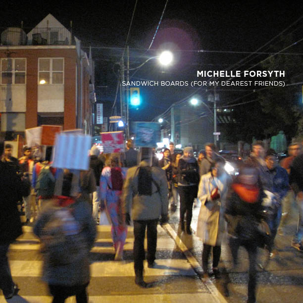
MICHELLE FORSYTH, SANDWICH BOARDS (FOR MY DEAREST FRIENDS)
Karl-Gilbert Murray, Historien de l'art
for Nuit Blanche Independent Project Catalogue
[ + Read ]
In a crucial effort to engage with the spectator, the work Sandwich Boards (For My Dearest Friends) is designed to shift our perception of the immovable nature of things. Primarily, the work consists of walkers/carriers making their way through the streets of Toronto in sandwich boards, thus freed from the constraints of established art institutions, peddling a collection of painted reproductions of textiles with decorative patterns that imitate the clothing worn by the artist’s close friends. Conceptually1, each board, by revealing a number of emotional relationships that transcend the symbolic iconography of the geometric, tiled and/or floral prints, signifies a friend — physically absent but very much present, embodied in the formal and stylistic forms of the print fabric.
Constantly morphing as it wends its way from one place to another, the work reveals a panoply of cultural atavisms that, depending on the context and the influence of the environment, elicit personal recollections through fortuitous encounters. A wearable work, it reminds us that not only does clothing play an important role in our daily experience of others, but also that fabric envelops the body and, like a second skin, conveys things differently. Nomadic, the work proceeds along a path initiated by the walkers/carriers who, through their random interactions, stage the body-mounted paintings, establishing a communication dynamic that goes well beyond a simple urban stroll.
Hence, one might say that the work defines a set of distinctive signs since these body-mounted paintings, informed as they are by references to Forsyth’s personal relationships, weave a gallery of portraits, especially the ornamental aspect of the prints, which influence our judgment (too often constructed by prejudices). Also, however, powerfully evocative and laced with elements liable to stir up forgotten moments, words, acts, and even the scents of life, the prints both attract and elicit memories. Indeed, invested in memory-evoking potential—as if to seek balance or a stylistic analogy visually linking the canvases to the individuals to which they refer—the work conditions our image of the other. An image invented according to our own subjectivity and creativity whose process of fabrication, complete with imperfections, reinforces the unique character of each painting. Thus, the work expands upon the uniqueness of decorative patterns that, rooted in the world of emotional memories, induces a sense of proximity between the public and the work.
So, in the name of democratization, the work hopes to embed art in daily life and to inhabit the urban space at the very point where the personal intersects with the public. A present-day representation of remembrance, this procession of “wearable paintings” acts upon our relationship to the world by exploring various forms of urban wanderings while, collectively, making it possible to celebrate our emotional attachment to our loved ones. This secular rite prompts all of us to contemplate the presence of absence—the absence of friends reduced to no more than a scrap of cloth, which kindles a metaphor about the virtues and power of friendship.
Karl-Gilbert Murray, Historien de l'art
1. Forsyth’s work echoes André Breton’s performance during the Dada Festival at the Théâtre de l’Œuvre (Paris, 1920) when he wore a sandwich board with a poster by Francis Picabia upon which was written, “To love something you must have long seen and listened to a passel of idiots.” Calling into question the notion of originality, this performance hoped to shake the received idea of institutionalized art while inviting us to seek elsewhere, in the most unlikely places, for artistic creativity. Sandwich Boards (For My Dearest Friends) also questions the meaning of art much as Daniel Buren, during a site-specific work entitled Hommes-Sandwichs (1968), made it possible to understand the work in another way, through a random meeting, a detour down an alley.
--
L’œuvre Sandwich Boards (For My Dearest Friends) est destinée à déplacer le regard que l’on porte sur l’inertie des choses dans une tentative ultime de rapprochement avec le spectateur. L’activité principale consistant à circuler dans les rues de Toronto, les marcheurs/porteurs, sandwichés entre deux panonceaux, colportent, au-delà des frontières institutionnelles de l’art, une gamme de reproductions peintes de textiles à motifs décoratifs – imitant fidèlement des vêtements ayant appartenu à de proches amis(es) de l’artiste. Conceptuellement1, divulguant nombre de filiations affectives qui transcendent la symbolique iconographique des imprimés géométriques, carrelés et/ou fleuris, chaque placard désigne un(e) ami(e) – absent(e) de corps, mais toujours présent(e) au travers des modalités formelles et stylistiques des étoffes peintes.
Se métamorphosant continuellement au fil des déplacements, l’œuvre révèle ainsi une panoplie d’atavismes culturels qui, selon le contexte et l’influence de l’environnement, provoquent des réminiscences personnelles au travers de rencontres hasardeuses. Portative, elle nous rappelle non seulement l’importance que jouent les vêtements dans l’expérience quotidienne du sens de l’autre, mais aussi que le tissu est une enveloppe corporelle (une seconde peau) qui dit autrement les choses. Nomade, elle défile au gré des aléas des parcours initiés par les marcheurs/porteurs qui, dans leurs interactions aléatoires, mettent en scène des corps-tableaux soutenus par un dispositif de présentation, instaurant une dynamique communicationnelle qui va bien au-delà de la simple déambulation urbaine.
Dès lors, pourrait-on dire que l’œuvre délimite un ensemble de signes distinctifs puisque ces corps-tableaux, qui interpellent des références à l’entourage personnel de Forsyth, tissent une galerie de portraits dont les imprimés, focalisant sur l’aspect ornemental, influencent le jugement (trop souvent façonné par des préjugés). Aussi, dirait-on qu’ayant un fort pouvoir d’évocation, ils convoquent indubitablement autant de souvenirs qui s’éveillent à leurs contacts qu’ils renferment des affects susceptibles de faire surgir des moments oubliés, des paroles, des gestes voire même des odeurs de vie. À cet effet, misant sur le potentiel commémoratif – comme s’il s’agissait d’une adéquation ou d’une analogie stylistique établissant une parenté visuelle entre les tableaux et les individus auxquels ils font référence –, l’œuvre conditionne l’image que l’on se fait de l’autre. Une image inventée au gré de sa subjectivité et de sa créativité dont les procédés de fabrication, intégrant des imprécisions, renforcissent le caractère unique de chaque tableau. L’œuvre discourt ainsi sur la singularité des motifs décoratifs qui, associés au monde des réminiscences émotionnelles, introduisent un sentiment de proximité entre le public et l’œuvre.
Au nom de la démocratisation de l’art, l’œuvre a donc pour volonté de s’inscrire dans la vie quotidienne et d’investir l’espace urbain – là où la vie intime entre en contact avec la vie publique. Représentation contemporaine d’une commémoration, ce défilé de « tableaux portatifs » agit sur notre rapport au monde en explorant diverses figures de la déambulation urbaine tout comme, il permet, collectivement, de célébrer notre attachement affectif avec nos proches. Telle une procession profane, il invite tout un chacun à contempler la présente absence d’amis(es) qui, ne pouvant prendre une autre forme qu’un « lambeau de tissu », induit une métaphore aux vertus et la potestas de l’amitié.
Karl-Gilbert Murray, Historien de l'art
1. L’œuvre de Forsyth, nous rappelle la performance d’André Breton qui, vêtu tel un homme-sandwich, lors du Festival Dada au théâtre de l’Œuvre (Paris, 1920), portait une affiche de Francis Picabia sur laquelle on pouvait lire : « Pour que vous aimiez quelque chose il faut que vous l’ayez vue et entendue depuis longtemps tas d’idiots ». Questionnant la notion d’originalité, cette performance visait à décentrer l’attention que l’on portait sur l’institutionnalisation de l’art tout comme elle invitait à chercher ailleurs la créativité artistique – là où on s’y attendait le moins. Aussi, Sandwich Boards (For My Dearest Friends), interrogeant le sens de l’art tel que Daniel Buren l’aura fait lors d’une intervention in situ, intitulée Hommes-Sandwichs (1968), permet d’appréhender l’œuvre autrement : au hasard d’une rencontre, au détour d’une ruelle, etc.
ASSEMBLY/ABSTRACTION: MICHELLE FORSYTH'S KEVIN'S SHIRTS
Kendra Ainsworth
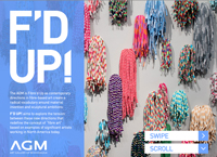
F'd Up
The Mississauga Art Gallery
Posted March 2014
[ link. ]
[ + Read ]
Amidst the many large, arresting installation pieces in the Art Gallery of Mississauga’s recent exhibition F’d Up!, Michelle Forsyth’s works might seem dwarfed or unobtrusive. But the significance of her art in the context of this exhibition goes far beyond the relative small scale of the works themselves. Taken from a larger series recently exhibited at Auxiliary Projects in Brooklyn, Forsyth’s Kevin’s Shirts makes poignant, if potentially conflicting statements on both our global and personal realities; the work offers a commentary on how as a society we are increasingly out of touch with our physical surroundings, and yet speaks to how we interact, on a very intimate level, with the people and objects we encounter in our day to day lives. Much of the academic and theoretical content of F’d Up! turned an eye on the nature and history of fibre-based art and the connotations associated with the medium. Not only must artists and critics alike contend with the tendency toward categorical distinction between art and “craft,” with fibre-based practice being consigned to the latter group, but more specifically, they must also grapple with the commonly held, if simplistic and potentially apocryphal association of work with fibre and textiles as historically “women’s” work. Here, Forsyth’s work creates an interesting starting point for discussion.
Kevin’s Shirts consists of four 10” by 10” paintings which render the plaid patterns of Forsyth’s husband’s shirts in gouache on paper. The paintings are accompanied by several weavings, haphazardly strewn on the gallery floor, which once again transpose Kevin’s Shirts from their almost abstracted form in painting, back into textile. A cursory reading of the textile components of Forsyth’s work may lead the viewer to thoughts of female labour, either through the historical context of hand or industrial weaving; or more contemporary associations with the traditionally female domestic labour of laundry - the weavings call to mind a disorderly bedroom floor - but the artist counters this notion. In conversation with the author, Forsyth intimated that her husband was always the one to do the laundry in their household. And not only has she never viewed weaving or textile work as “women’s work,” here the textiles serve as an emblem of both how arbitrary these gendered associations are – heaps of cloth on the ground speak to the absence of Kevin and his domestic efforts – and of the intrinsically personal quality that objects take on in our lives. For Forsyth, the fibre elements in her work are more about intimacy than gender.
Starting this particular series while her husband was away on sabbatical, Forsyth was looking to document, capture and remember her husband through the tangible traces he left in their living space – his clothing, a uniform of plaid shirts. She began painting, taking the mass-produced textile patterns and at once bringing them into the abstract, and at the same time reconnecting them with the artist’s or maker’s hand.
Glenn Adamson asserts in The Invention of Craft that craft is something that was created alongside industry as its other, rather than something industry arose out of or advanced from. Forsyth produces a form of “craft” that not only acts as a foil for industrial production but that “others” it. Mass-produced clothing goes through so many processes, places and machines in its travels from the designer’s sketchbook to our closets, and yet it is so ubiquitous and normal that we frequently don’t consider the global industries and implications of its production. Through her paintings, Forsyth takes these products, rich in material history and political and economic significance, back to their most basic component parts: colour, line, and pattern, rendering the original reference preternatural in the process.
In creating a simulacrum of these shirts, which themselves epitomize our age of industrial facsimile, Forsyth calls attention to how removed we are from the production of items we use every day. Our disassociation, or abstraction from the Real is effectively countered through painterly abstraction. Although Forsyth’s paintings are inherently representative, this second order abstraction - as it serves to dissociate and decontextualize the component elements of Kevin’s Shirts , and by extension all manufactured products, from their original ground - forces us to slow down and contemplate the process of this new form of creation. This forced change of perspective is also compounded by the stylistic elements of the paintings, which call to mind the meditative quality of Agnes Martin and similar artists associated with abstract expressionism. And ironically, it is this abstraction that actually reintroduces the idea of the maker or creator back into the process of production. Upon close inspection, the artist’s hand is visible in the subtle irregularities of paint and composition – making visible the labour of creation; a physical inscription of the methods of production into the picture. This maker is brought even more evidently to the forefront as the paintings are transcribed from the page to the loom, and back to the very roots of textile work, to the traditionally “hand-made.”
Interestingly, Forsyth, a painter, only learned to weave for this project, feeling that the paintings just needed to become textiles. Where she enjoys the doubling and tripling of the same pattern, each version with its attendant variations, this transposition of the simulacra back (or forward) into fibre re-contextualizes the original subject. And even as Kevin’s Shirts move through these artistic iterations and are abstracted further and further from both the intent and implications of their initial form, to Forsyth, all forms are her husband’s shirts. In this sense, all the components of Kevin’s Shirts are a paean to the intimate connections that we have with everyday objects. Forsyth notes that artists are well placed to call our attention to these connections and relationships; painters often work alone in the studio, seeing and using the same objects every day, imbuing them with almost a magical, ritualistic significance. Indeed it is these objects that she saw every day that served as inspiration for Forsyth – objects that, although ordinary and mass produced, were already inherently ripe with significance in their status as markers of absence. If we view craft as a process, a way of doing things, and something that is inherently tied to material experience, perhaps it is fitting that Kevin’s Shirts is entirely dependent on process – the transformation of artifact to painting and then to textile sculpture. Here, Forsyth’s artistic practice in and of itself serves to reinvigorate our notions of what craft is. Not a lesser cousin to “art” nor an essentially gendered practice, it is a way of thinking through the world, and our personal connections to our surroundings. And that is something that we can all appreciate.
- Kendra Ainsworth
Assistant Curator at the Art Gallery of Mississauga, is an interpretive planner and curator. She has a Masters in Museum Studies and a B.A in Cultural Anthropology from the University of Toronto, and has been working in the arts and culture sector for over six years. She is strongly committed to making museums and galleries of contemporary art and craft intellectually, physically and emotionally accessible spaces for visitors. Through creative curation and interpretation, Kendra aims to remove both intangible and tangible barriers to public engagement with contemporary art, and allow it to serve as a catalyst for community building and intellectual development for people of all ages. Past projects have included exhibitions at the Burlington Art Centre (The Art of the Cut: Papercuttings by Lini Grol, 2013), the Gardiner Museum (Sugar and Spice, 2011) and the Art Gallery of Ontario (At Work: Hesse, Goodwin, Martin, 2010).
WARP & WEFT
Sharon Butler
Two Coats of Paint (Blog)
February 4, 2013
[ link. ]
[ + Read ]
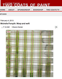
A faculty member at the state university in Pullman, Washington, Michelle Forsyth is undoubtedly surrounded by plaid. Once the symbol of the Scottish Highlands, in the 1990s plaids shirts came to symbolize the Northwest grunge aesthetic and have since become a staple of mainstream fashion vernacular. In "Letters for Kevin," a solo show at Auxiliary Projects, Forsyth presents a series of paintings and hand-woven cloths that reference the plaid patterns of her husband Kevin’s shirts.
Tacked on the wall in a grid formation, 94 small studies transcribe the mass-produced plaids into a heart-felt, painterly language, replete with crooked lines, pooled paint and rough edges. Both observational and abstract, Forsyth's paintings conjure Sylvia Plimack-Mangold’s 1970s wooden floor paintings and Lula Mae Blocton’s less familiar depictions of Kente cloth.
The charming installation at tiny Auxiliary Projects also includes several woven plaid cloths that Forsyth made on a loom, a small mural, and an elegant painting on linen. Perhaps referencing laundry and domestic tedium, one cloth is thrown in the corner and the others are stacked in a neatly folded pile. Forsyth’s work seems to suggest that despite our inundation with mass-produced goods and our ready conformance to sartorial stereotypes, singular expression and reverie can flourish, even within the most mundane domestic circumstances.
OVER AND OVER AGAIN, THE NATURE OF MEMORY
Frances De Vuono
Over & Over Catalog
The Hogar Collection, Brooklyn, NY
February 3, 2010
[ Download pdf 40kb. ]
[ + Read ]
There is something at once both lush and sharp about what Michelle Forsyth does as an artist. In nearly everything she makes—from small works on paper to large installations—she affirms the handmade. From a distance her works often lock into representation, a suggestion of narrative and place, but close examination reveals that the images are made of cutout pieces of fabric and paper, beads stitched to the paper or mounted on with dressmaker’s pins. Many of her most recent pieces have additional layers of prints on their surface. For this, Forsyth begins with hand drawing on film; she then exposes these drawings onto the screens and, like traditional fabric artisans across the world, she repetitively pushes the inks through the screens onto the paper over and over again. This is work that celebrates the laborious.
Forsyth is interested in history, specifically public and private memories of tragedies and traumas. To this end, she makes her images by embarking on a series of activities. For each of the pieces in both the 100 Drawings and Ostinatos series here, she begins by researching an event through archived media; then she travels to the site where the incident originally took place and photographs the spot. Neither the tragedy itself, these well-sequenced steps, nor her conceptually loaded purpose stops Forsyth from additionally reveling in beauty. In all her work (excepting the Text Works) she manipulates our penchant for pleasure, loading her carefully crafted documentations with vibrant colors as if they were tapestries.
In his novel, Love in the Time of Cholera, Columbian author Gabriel García Márquez referred to memory’s pathway towards nostalgia as a disease. Forsyth, born in Canada, at a colder, near opposite end of the American hemisphere, must have a similar feeling about memory and its ability to course through time, mutating and changing along the way. Forsyth consciously photographs a chosen disaster such as Tacoma Narrows Bridge Collapse, Tacoma, WA, November 7, 1940 years after it actually took place. The artist’s deliberate acknowledgement of years passed implies that something can still be gained by remembering and seeing, as though the geography holds unseen particles of its past. In the studio, Forsyth then isolates elements from these photographic records and breaks them down further into minute units, which she finally, painstakingly reconstructs back into images again. The results are a plethora of shapes and colors with their own abstract logic that initially makes no narrative sense until we move back. Standing close to a work like Hoboken Pier Fire, Hoboken, NJ, June 30, 1900 is akin to having used the zoom function on a digital camera or a computer. It is a pixilated image, rendered into 3-D by its compounded materials, but we only see it as a real place when we move away from it. And that, of course, is arguably the best way to make sense of our past as well. Forsyth’s description of historical events fractured into tiny bits, suggests that memory could be—or should be—a kind of hologram, only truly understood within the context of its many parts.
While it is clear that Forsyth’s pieces pay tribute to the handmade, it would be a disservice not to acknowledge her equally crucial engagement with technology. Describing the early stages of her process in doing research and in organizing her images, Forsyth states that she takes images “culled from television, newspapers, and the Internet…” using a grid, she translates this visual information into the vibrantly tactile work seen here, variously using cotton thread, bits of gouache painted papers, crystal and more. Conscious of the implications between her ideas and working methods, she explains, “The grid becomes a nexus between the bitmapped images [of the computer] and the hand-crafted ones.” Her very language confirms the importance contemporary technologies play in her work, affirming the observations made by artist (and now theorist) David Hockney who claimed in his book Secret Knowledge, that artists have always embraced the technology of their times and that the best ones turn it to the service of their ideas. Forsyth admits that freely. But in her case, she adds “I use technology to slow my process down instead of speed it up.”
This exhibition draws from three different series done over the past four years: 100 Drawings, Ostinatos and Text Work. While both the two former series use the processes described above and are layered with colors, forms and materials, Text Work does something unexpected but utterly in keeping with Forsyth’s purpose. Using the same newspapers and online sources where Forsyth habitually gathers her visual imagery, for Text Work she eschews color and collected material. Instead she extracts the actual words that witnesses have used to describe historical events. She isolates their verbal responses the way she had formally isolated patterns from pictures, taking phrases and carefully punching them into paper. The resulting pieces are made of light and absence. The shapes that the cutout type leaves are a pentimento of text. It is a ghost of meaning and memory. Showing this simpler, quieter series in conjunction with the more layered works makes for a perfect pairing. Edwin (eyewitness) and Tacoma Narrows Bridge Collapse, Tacoma, WA, November 7, 1940 demonstrate this explicitly because they both deal with the aftermath of the same disaster. But all three series work in a kind of rewarding synchronicity.
Seeing the richly layered Ostinatos and 100 Drawings in conjunction with the spare, punched out ‘imagery’ of Text Works is a deft curatorial move. What the two different visual depictions suggest is that while we tend to understand our past by aggregate information, we also need to remember that absence of data, information and material is an equally integral part of its nature. We need both.
MICHELLE FORSYTH: AN INTRODUCTION
Brian Grison
Canopy Brochure
USM Art Gallery, Gorham, ME
February 24, 2009
[ Download pdf 324kb. ]
[ + Read ]
Writing is a form of therapy; sometimes I wonder how all those who do not write, compose or paint can manage to escape the madness, the melancholia, the panic fear that is inherent in the human condition.
—Graham Greene
The origin of an artist’s work is often found in childhood experience rather than in education or influences. It is useful to know how these origins continue to resonate through an artist’s later life and work. Writing in Solitude: A Return to the Self, psychologist Anthony Storr outlines how many artists’ creativity, often in the form of life-long projects, develop as compensation for childhood trauma. This essay about Michelle Forsyth’s art and practice will reflect Storr’s observation.
Michelle Forsyth grew up on sailboats; between ages eight and sixteen she sailed with her family for three months each summer through Desolation Sound off the coast of British Columbia. Unfortunately, for the young Michelle, sailing seemed acutely dangerous and disaster-prone. Every day she expected the worst. Her constant anxiety and watchfulness evolved into daydreamed stories about disasters at sea, forest fires, urban destruction and the end of the world. Novels about shipwrecks and other disasters that her father enjoyed reading further encouraged her imaginary fears. Children like to frighten themselves, but in this case, there appears to have been no escape, and Michelle hated being frightened.
However, the ocean can be frightening. A sailor must always be careful, and always be prepared for, if not actually expecting, the worst. A sailboat is designed for the dynamic environment of waves, tides, currents and wind. Sailing life is often reduced to holding on, watching the approaching waves or shore, and shouting warnings and instructions. Probably the young Michelle and her two sisters always wore lifejackets, a metaphoric safety line to the boat, but no guarantee of security. She remembers having to watch for rocks while her father maneuvered the boat in tight places. It did not help that he was an aggressive sailor who enjoyed sailing flat out against the wind, and liked putting his family on edge with daredevil antics.
Today, memories of the insecurity of her sailing childhood have evolved into a psychologically and culturally difficult subject and methodology in her art practice. She now searches for a stable balance among her memories, anxieties and craft-like systems in her studio practice to depict the real historic disasters that her work commemorates. Through a kind of voyeurism, she compulsively unravels the personal psychological impact of the dangerous world, both real and imagined, that she was brought up in, as well as actual historic and contemporary disasters she witnesses through television and the media. These concerns supersede aesthetic, craft process and social or political concerns.
Much of Michelle Forsyth’s art prior to this exhibition can be characterized as documentations of secret ritualistic pilgrimages to scenes of disasters, which she experiences obliquely and intuitively. Instead of employing historic photographs, she surreptitiously records metaphors of the site through digital images of mundane near-by presences, such as flowers or clouds, which have no relationship with the historic disaster. The photographs are then translated into thousands of tiny brightly colored, mosaic-like, brush marks, cut paper shapes, found material and glitter, which she paints, or stitches to paper, or pins to walls. She does not recreate images of the disaster itself. Instead, her paintings, empty of horror, are an elegy to the social loss of memory of these events.
Two works related to the same disaster encompass the full range of Forsyth’s concerns and methods. On June 17, 1958, the Second Narrows Bridge in Vancouver collapsed during construction. Eighteen workers were killed. Michelle Forsyth’s grandfather, who was fishing for crab nearby, was able to rescue several men who had fallen into the water. In the 1990’s the bridge was renamed the Ironworker’s Memorial Second Narrows Crossing, with memorial plaques at both ends.
In the small watercolor and gouache drawing from 2007, Second Narrows Bridge Collapse, Vancouver BC, June 17, 1958, Michelle Forsyth depicts a few small wild flowers near the north end of the bridge. Only vague shapes and color emerge through elaborate patterning to reference the flowers, though they coalesce slightly through squinting. There is no clear pointer to the bridge collapse. Instead, the viewer is drawn into the mesmeric interplay of the carefully applied layers of pattern and color. The historic disaster, as well as its memory, has faded away.
The second, much larger, work is more ambitious. June 17, 1958 (for my grandfather), produced a few months later in 2007, is materially closer to Forsyth’s creative origins in knitting and needlework, which her mother taught her. Based on a slightly different digital photograph of the same group of flowers, the image has been divided into one-foot sections and then gridded. Forsyth organized a replica of this pattern with one-inch thick pieces of Styrofoam. Into the center of each one-inch grid across the Styrofoam she pins several layers of flower-like shapes that she spends hours cutting from painted paper, Color-aid paper, sandpaper, decorative papers, beads, sequins and glitter. These assorted colors and textures that accumulate on each pin replicate the colors of the photograph in much the way that French Impressionist paintings reduced the subject to a loose grid of colored spots. Once complete the pins were transferred from the Styrofoam to the gallery wall.
This memorial to Michelle Forsyth’s grandfather’s heroic action during the collapse of the Second Narrows Bridge is closer in materials and methods, as well as spirit, to the installation, titled Canopy, she has constructed at the University of Southern Maine. The knowledge and assurance that her grandfather could set the precarious world right for others, and therefore for herself, must be read as a milestone in her career. Chronic grief as negative self-identity has shifted to the notion that the hard work, both physical and psychological, that she learned her craft methods is a meditation on the lifeline between a traumatic childhood and her mature self, and points to the new theme of the canopy as a source or protection in her newest project.
— Brian Grison
Brian Grison is an artist and writer currently living in Victoria BC Canada. He holds a BFA and a BA from the University of Victoria, and an MA from Carleton University, Ottawa.
MICHELLE FORSYTH: INTERVIEW
David Drake
Field Work Catalog
Zaum Projects Contemporary Art, Lisbon, PT
October 30, 2008
[ Download pdf 48kb. ]
[ + Read ]
The following conversation took place between the Michelle Forsyth and David Drake via email during the Month of October 2008.
DD. We've talked about connections between your work and the ideas and strategies of the first generation of conceptual artists. Some of those connections I think are quite clear: the "Drawings" continue investigations into the philosophical problem of presence and absence, for example. But other strategies you employ I'm tempted to regard as radically different, particularly the way you approach art-as-object. Your objects are not dematerialized, demystified and stripped of their aura; rather, through craft, you've raised up humble materials (sandpaper, felt), and applied a jewel-like aura to them. You've attempted to re-invest banality with meaning, maybe even mystery.
And, I want to say, these objects you make--these traces of obsessive studio practice, of travel to the sites of used-up disasters--these objects are also unapologetic commodities. They sell.
I say I'm tempted to regard all this as differing radically with conceptual antecedents. In fact, I think this is also an area of connection: that a similar set of interests results in a drive to dematerialize and decomodify at one time, and the opposite at another.
MF. I am really glad you have brought this up. It is something that I do struggle with. On the one hand I am ultimately driven by moving my work along a solid conceptual trajectory yet on the other I get fully caught up in the materials I chose to work with. I guess I was first interested in the spectacular images that these events conjured up in my mind--exploding ships, bridge collapses, burning forests--and that sense of drama is something that can be seen in the way my materials catch the eye, but what I am ultimately thinking about is how I can pay homage to what is left behind. When I traveled to the first few sites I found myself a little disappointed by what I found there. There wasn’t much to see--a few dandelions or some scrap tires--but when I brought my images back to the studio and set to work I just started trying to fill the absence with the accumulation of residue left behind by my working processes.
I think ultimately what comes into question is the photographic document. When conceptual artists began to document their working processes it opened up a new way to represent things that were more ephemeral. But ultimately the evidence was commodified too. The images of this work--and I am thinking of pieces like Robert Barry’s Inert Gas Series, or Michael Heizer’s Double Negative--are often beautiful. Photographic documents of disasters are also aestheticised, but the results are often more spectacular. I am interested in finding an alternative to this kind of photographic staging. And although I use historical photographs of disasters as a starting point, and re-photograph those sites as they are today, I think that ultimately I am trying to seek alternatives to how these kinds of events are remembered.
DD. When I said you're re-investing banality with meaning, I was initially thinking of the banality of some of the materials you use--the sandpaper and felt, but also the Swarovski crystals, which somehow remind me of a come-on for an item on QVC or the home shopping network. But your comment suggests there are at least two other categories of the banal at play in your work. First, there is the banality of what I guess we could call the spectacle of the disaster (following Debord) wherein every image of horror becomes drained of its power thru endless repetition (the Hindenburg, the Crucifixion, the plane hitting the second tower, the burning Vietnamese girl). And second, there is the banality of the real place where the disaster once was and is now absent. With that in mind, and with your comments on filling that absence, I am now reminded of all those ways we have learned to use the simplest and most banal of materials to enshrine the places of tragedy: the plastic flowers and stuffed teddies wedged into cyclone fencing around the site of the latest school shooting, for example. Is it possible there is an element of that in your work? A knowing use of that?
It seems to me we are driven to memorialize and make meaningful that which already plagues our memories and resists meaning anything. And that the materials we have to work with, whether plastic or platinum, are as inadequate to the task of commemorating these events as our souls are to comprehending them. Which is pretty flowery.
But I think there can be something truly beautiful, touching and human (in an older sense of the word) in the deeply inadequate.
MF. I think that there is an element of this in my work to some extent, but instead of leaving something behind at the scene, I am instead drawing from it. I am certainly influenced by the ways in which people memorialize events publicly. I was living Jersey City when 9/11 happened and watched the second plane hit the towers, but kept running into my apartment to watch it on the TV. It helped me to understand what was going on at the time, but afterward the images were played over and over, which drowned out my own experience. Lower Manhattan was plastered with photographs of loved ones and there were a lot of ad-hoc shrines and candles, which I think was ultimately a more powerful reminder of what had happened. You could really get a sense of grief from it. The first time I saw the empty pit where the towers once stood I experienced a similar feeling.
I guess I see the detritus left at disaster sites in a similar way. What has been left behind or discarded becomes poignant for me. But I also think of my working process as a residue of a repetitive yet intimate manual labor--stitching, cutting, painting, punching, pinning--, which provides a space to think about things. I need to get lost in this way in order to elevate my materials to an elegiac level. It can also be a good way to forget certain things, which is perhaps why I am in the studio so much. I also think about control, about honing my skills, and making my work as beautiful as it can be.
DD. I'm interested in how you would trace the trajectory of your work over the last 6-7 years, from the accident and water pictures, to the paintings and drawings you're making now, and to the text work you've just begun. We've talked before about the role of the sublime in that earlier work (in its fullest sense: a beautiful terror), but also the banality inherent in the source images you were using. How the snapshot, whether of a glittering body of water or the visceral aftermath of a suicide or traffic accident, renders a numb sameness to all the images (especially when seen online). And how your transformation of those images begins to recover the impact (the sublime) the real events or vistas imaged once had.
At the simplest level, I see your current work as collapsing together what was once two separate bodies of work: the water and flower pictures now are the images of accident and death. And the scope and scale of the disasters has expanded from the personal and the unreported, to the spectacular, the historical, and the newsworthy. I wonder if there is a connection here: that in some sense, if the visible scrim overlaying the idea of a disaster is innocuous (a few flowers, a view of a river), then the underlying disaster must be something larger than an anonymous suicide or car crash.
The other shift I see is toward an increasing materiality in your work--to my mind, they have become objects, even if you still refer to them as drawings or paintings.
The newest work I'm least familiar with, so I'm particularly interested in how it might fit with the ideas I've outlined here (assuming the ideas have validity).
MF. When I had first begun working with these horrific images of personal trauma and death, I was pretty unsure about what I was doing. I was initially interested in how they seemed to lose something in their endless repetition--in a Warholian sense--but I found myself staring at these images for great lengths of time and it was pretty disturbing for me. So I started working on the paintings of water. The images seemed much more benign, but when I placed them beside the others there was a striking similarity: they both evoked a sense of distance. Looking back, I think something else was happening too because I was working through my emotions in those water pieces. I think that’s where a kind of mourning took place for me, if you could call it that.
I was also feeling that the work I was making at that time was becoming exploitative in the sense that I was using images of other’s pain for my personal gain. I didn’t want to keep doing that. I also didn’t want to keep making more bloody images. I wanted to allude to the same ideas without being so explicit. So I think you’ve touched on something interesting when you draw a line between the spectacular nature of the disasters I am documenting on one hand and the innocuous “scrim” that I have chosen to work with on the other. I haven’t really thought about it quite that way before but find it intriguing. Perhaps it is because of this gap that I have written the short paragraphs to go with the work. I think the newer text pieces are an extension of those narratives, but they also have a relationship to my Sunday Paintings from 2006.
DD. In your second answer, you said you try to make your work "as beautiful as it can be." I wonder if you can discuss at length, and pretty specifically, what constitutes beauty: for you, for the work, for the materials and imagery you work with, and for your viewers/collectors.
MF. I think there is a fine line between making something beautiful and pushing it too far, which can quickly move into the realm of kitsch, particularly when you are using things like sequins and glitter to get there. I guess that my statement about a desire for beauty seems to imply that it is my intention to focus on the object alone rather than the process of making it, but I think for me the two are intrinsically linked. Beauty emerges from experiencing a kind of reverie while making; from a place where I am completely engaged in the task at hand; when I get caught up in the loop of a brush stroke, the movement of my scissors, or am taken by a particular color resting against another, and repeat that over and over until I am somewhere else. My process can be like knitting or needlepoint in that way. The objects I make are also very important to me. I want them to be encrusted with process and almost overworked. I have always been fascinated by Rococo and all the violence underpinning it. I think this shows in the work. When paired with something tragic, I think beauty can be extremely poignant.
Maybe I threw in a loop when I mentioned Rococo. I mention it not because it is associated with beauty for me, but it is over the top and almost campy somehow. I am interested in it but think it is kitschy. Like I want to get some hints from it but transform it. I think of my work as an amalgamation of everything I have learned or am interested in. I try to pack it all in there.
I am interested in using beauty to create a place for my viewers to experience a kind of rapture in some way. Therefore, I am attracted to things that could be considered beautiful--or even sublime if you want to put it that way--and perhaps even go a bit out of my way to find subject matter that interests me on a poetic level. Flowers have become increasingly prevalent in my work. I have been seeking them out at disaster sites and have been using floral motifs in most of my cut-paper pieces as well. I think they can speak more directly about loss, both because they are so fleeting and because they are often used as a way of marking death. Manet’s last paintings, completed as he was dying, were of flowers. They are filled with tragedy yet are deeply beautiful paintings.
DD. Some final thoughts: I think the beautiful (which emerges as the axis of this whole conversation) is a concept we cannot define, but only point to (either literally, or by making images). Your work, in pointing to the beautiful as it exists in situations where we don't expect it, is ultimately investigative rather than decorative--a way of asking what it means for a thing to be beautiful. It is that investigative quality which connects it with conceptualism, and Proust (it is, after all, In Search of Lost Time), and removes it from the actual practice of the Rococo (although I see exactly how Rococo figures in what you do, and have been doing, even back to those very early "King" paintings).
HISTORY REPEATING: MICHELLE FORSYTH TRANSLATES HORROR INTO PATTERN
Wendy Welch
Monday Magazine, February 6th Edition
Victoria, BC
February 6, 2008
[ Download pdf 196kb. ]
[ + Read ]
Tragedy disguised as beauty. Horror translated into pattern. These are some of the elements in Michelle Forsyth's Then & There: Work from the One Hundred Drawings Project, currently on view at Deluge. Photographs of disasters are the source material for these highly decorative and detailed paintings. We are continually confronted with a barrage of media images depicting human suffering and Forsyth questions the long-term effect this exposure has on our psyche and on our ability to empathize. Rather than merely skimming through a plethora of disconcerting images, Forsyth lingers on a few specific ones and proceeds to recreate, and thereby reinvent, their content. Images move from scenes of disasters to spectacles of colour through her elaborate patterning process.
Forsyth grew up on the West Coast and spent a good deal of her childhood living on a sailboat. She would concoct not-so-unlikely (considering her circumstances) fantasies of being lost at sea or swept up in a dramatic storm. This experience left Forsyth predisposed to speculate on possible impending and real disaster situations. The use of found images (often gleaned from websites such as rotten.com) could appear to be voyeuristic, but Forsyth attempts to invoke the conscientious gaze of an empathetic outsider. While she might have no personal attachment to the particular incidents she addresses in her work, this lack of connection is compensated for by an intense intimate involvement with each photo through an elaborate artistic process--sometimes involving the use a tiny brush made of only a few hairs. But unlike a voyeur who might enjoy looking at images of disasters for the sheer fascination factor, Forsyth takes the process one step further with visitations to the sites of each event she chooses to portray. These "scene of the crime" visits are a way of making depicted incidents as real as possible without actually having been there at the time of occurrence.
A computer-generated grid pattern is layered on top of the photographic image to establish colours and values that are then painted on paper with gouache. A paradox ensues--as the work gets more detailed, it becomes less descriptive. This oblique subject matter gets returned to its literal source with descriptive text panels accompanying each painting. The detail-oriented text leaves you looking for images in the surface that can no longer be found--reminiscent of the photographic visual clues in Michelangelo Antonioni's film Blow-Up, impossible to ignore and yet impossible to define.
Forsyth found that after 9/11, many of her repeated abstract shapes were being interpreted to be Islamic geometric patterns. The work began to acquire unwanted or unintended meaning. It was at this point she created patterns made of flowers. So rather than being an arbitrary design, these new patterns added another layer of meaning in that flowers are often used as commemorations on sites of disasters or death.
Forsyth's most recent work consists of layered three-dimensional cut-out paper flowers attached to the walls with straight pins. This sculptural work has a physical presence that is evocative of the idea of a disaster, as its physicality is both fragile and real. This fragility doesn't come across as strongly in the paintings on paper that are carefully contained behind glass. The sculptures allow the flower image to become elevated from decorative pattern to metaphor for a memorial. Another strength of the relief work is that the images seem to hover over one another, challenging the viewer to attempt to discover layers of hidden meaning in the surface and its shadows.
Forsyth's work encourages us to question how we respond to tragedies outside of our own experience. It also makes us consider the role of beauty in art: is beauty used to anesthetize and make suffering and pain more palpable? Or is it used as a possible form of salvation or redemption for the human spirit? Most likely the answer rests somewhere between the two.
PALIMPSESTIC
Carrie Scozarro
The Pacific Northwest Inlander
September 6, 2007, p. 27
[ Download pdf 276kb. ]
[ + Read ]
Gonzaga's "Drawn to the Wall III" (through Oct. 6) has invited five Northwest area artists — Richard Schindler, Kevin Haas, Gina Freuen, Ken Yuhasz and Michelle Forsyth — to create site-specific "drawings." Like the 2004 "Drawn to the Wall II," which featured both 2D and 3D artists, this exhibition displays a wide variety of mediums: from charcoal to paint to ceramics, and even from neon to colored paper, felt and pinheads. The result? An interrogation of what "drawing" means. From the traditional to the unusual, an entire continuum of approaches to drawing is on display at the Jundt.
Parameters for the exhibition are unusual. First, the work had to be done on an 11-foot tall wall in situ (as opposed to being created in the artist's studio and "hung" on the wall). Second, the walls would be painted over at the end of the exhibition. Those were the rules according to Gonzaga director and curator Scott Patnode, who developed the idea for "Drawn to the Wall" six years ago...
The most extreme interpretation of drawing is Michelle Forsyth's "Fluorescence 5 (Flowers for Iraq)," which is mindboggling from any vantage point. Forsyth uses a grid of colored paper, felt and foam shapes on pinheads extending from the surface of the wall to capture, deconstruct and recontextualize images of horror she culls from pop media. Although they must be viewed from afar to be understood... they are intensely beautiful and surprisingly tactile from close up. Standing back mimics the way we view horror — as consumers of the "horror" genre and of sensationalized news media. Forsyth's work reminds us that we're an apathetic audience desensitized to violence.
The visual and conceptual potency of Forsyth's imagery moves viewers past the question of "Is this drawing?" and nudges them to a place that, like the other walls, negates the object-orientation of conventional art. The audience gets to see a "work of art," yet they cannot obtain or consume it — beyond, that is, the experience of viewing and thinking about it.
MICHELLE FORSYTH: INTERVIEW
Brian Sherwin
myartspace.com
May 23, 2007
[ Download pdf 624kb. ]
[ + Read ]
Q. I observed your work at the Bridge Art Fair in Chicago- your work was represented by the Hogar Collection. How did the exhibit go for you? I understand that this is not the first time you have been involved with the Bridge Art Fair.
A. The fairs this year have been a great experience for me. In Chicago I included six pieces from a current series of work entitled, One Hundred Drawings. The work has been a real departure for me, overall. I wanted to make something that did not rely on the spectacle to give the work its power, yet still draw from a large archive of images of catastrophe and disaster I had been collecting since the late 90's. Back in 2005 I took a road trip to the midwest and began documenting what remains at the sites pictured in many of the photographs I had been collecting. I started the project by going to sites in Chicago, so I was particularly excited about having some of the work included in the recent Bridge Art Fair. Todd Rosenbaum, the director of Hogar Collection, also took some of my work to the Miami Bridge Art Fair last December. That experience opened up a lot of doors for me and the work reached a wide audience.
Q. I viewed Hope Slide at the Bridge Art Fair. Care to tell our readers more about this piece?
A. Hope Slide is the ninth piece in the One Hundred Drawings project. The piece depicts a site just outside of Hope, BC (Canada) where an enormous landslide covered the highway on the morning of Saturday, January 9, 1965, burying four people in two cars. The highway now snakes around the foot of the slide and when you go out there you can still clearly see the swath of earth that slid down the mountain. Most of the sites I have documented have been places that really bear no trace of the events that have occurred at them, but the Hope Slide was different. I was astonished by how visible the evidence really was. At the base of the slide is a marker commemorating the lives of the victims of the slide. It also lists the names of six people who perished in two separate plane crashes that occurred on the same site. My piece documents a wreath placed at the base of this marker. So far I have documented twenty of the sites and have finished the first twelve works in the series, but I plan to do one hundred of them, eventually.
Q. You have stated that you "use painting, needlepoint and paper-crafts to counter the dehumanization of rapidly transmitted, digital images." Can you go into further detail about that statement?
A. I consider my work to be a reflection on, and a reaction to, the onslaught of images of suffering in our contemporary world. Peril and demise permeates our daily experience, and viewing dramatic events through the screen of a computer or television can often foster apathetic ways of seeing. I find this deeply disturbing and try to seek out elaborate ways of working in order to slow these kinds of images down. They do form a starting point for the work, yet I try to build surfaces that are tactile and intimate so that the viewer gets caught up in them a bit. Tedious brush-marks, dramatic stitches of color, barely visible hole-punches, cutout paper flowers, or diluted layers of watercolor dominate every piece I make in the studio. Sometimes you have to look pretty closely to discover some of the things I have done with them.
Q. Michelle, you have instructed art at several institutions including Pratt Institute and Washington State University. Are you inspired by your students? I assume that teaching art on the college level is a give-and-take of information...
A. I currently teach at Washington State University, which is located in eastern Washington. Living out here is a challenge because I live quite far away from any city. For this reason, I tend to form strong connections with my students and try to share as much information with them as I can. I grew up on Vancouver Island and when I was studying at the University of Victoria I was very involved in the art community there. People were eager to help each other and would work together to put up large exhibitions.
I have been thinking a lot lately about how my studio work intersects with my role as a professor and have been thinking about ways to get the two to come together more. I enjoy round table discussions and feel that craft practices that engage the community to be quite interesting (ie. the Stitch and Bitch). I have been invited to be a mentor at a residency program in Wells, BC this summer, and to be a visiting artist in residence at the University of Southern Maine in the Spring of 2008 and hope to use these opportunities to experiment a bit with this kind of model.
Q. You obtained your MFA from Rutgers University. Care to tell us about the art program there? Who did you study under?
A. Rutgers was a very rewarding experience for me. I worked primarily under Hanneline Røgeberg and Lauren Ewing, both of whom challenged me a lot. I feel that I am just now getting my head around some of the things that they suggested and am finally trying to answer some of the questions they opened up for me. My peers in graduate school were amazing. We had a lot of fun, but we also worked very hard.
Q. Can you go into further detail about how society has influenced your art?
A. Threatening visions -- from disaster coverage in the media and television shows that rely on individual suffering for entertainment, to violent video games and websites that display images of death -- surround us. In response to this, I hope to expose my grief through a compassionate process of translating the images into thousands of tiny, brightly colored brush-marks and glitter. "To grieve," according to Judith Butler, "and to make grief itself into a resource for politics, is not to be resigned to inaction, but it may be understood as the slow process by which we develop a point of identification with suffering itself."
Q. What has been the toughest point for you as far exhibiting or creating art is concerned?
A. I have always moved around a lot and I have never really felt the desire to set down permanent roots. Although there are many benefits to this kind of flexibility, it is often a challenge to make long term connections. I am often sporadic about keeping in touch with people.
Q. Can you explain some of your artistic process? How do you start a piece?
A. I spend a great deal of time on-line and I guess that is what really sparks the work. Each piece almost always begins on my computer and is usually sparked by some image that I have found on the web. I often have several projects going on at the same time and approach them in various ways, however they are all generated by the same collection of images.
Probably the most elaborate process that I have been working in is one where I translate the images into tiny fragments of cut paper circles and flowers. Entitled Florescence (Flowers for Iraq), these works depict the individual casualties of Iraqi civilians. The images are quite brutal, yet I have fractured them into tens of thousands of pieces that become memorials to those that have suffered from the brutal realities of war. Each piece of paper is hand cut and layered with felt and beads and is mounted to the end of a sewing pin. My paintings begin with a layer of intricate patterning before an underpainting is laid down in watercolor. Together the pattern and watercolor acts as a guide for me to start building up the surface with sinuous lines of gouache. Each work takes several months to complete.
Q. Where can we see more of your art?
A. I will have two upcoming solo exhibitions. One at Hogar Collection in Brooklyn this September and one at Deluge Contemporary Art in Victoria, BC in January 2008. I will also have a cut-paper installation piece at the Jundt Art Museum this August, and you can see my work online at http://www.michelleforsyth.com.
Q. Where do you see your direction of work going next? Care to reveal any of your plans?
A. I just received a grant from the Canada Council to continue my work documenting sites in eastern Canada so I am definitely going to continue working on that project, however I am making the newer pieces much larger in scale. Because I am enamored by complexity and detail as well as extremely elaborate methodologies, I also think I may try to make the work more layered or mottled in their surface treatment.
Q. Finally, is there anything else you would like to say about your art or the 'art world'?
A. I feel that it is intrinsically American to use horrific stories of death and destruction for entertainment purposes. According to Jean Baudrillard, "the countless disaster movies bear witness to this fantasy, which clearly attempt to exorcize with images, drowning out the whole thing with special effects. " As I find myself confronted by this onslaught, I mourn our tolerance of violence in the media and our inability to express a sense of vulnerability.
THE WAR ON TERROR; ABSTRACT PAINTING IN TODAY'S WORLD
Jerry Saltz
Juror StatemenT
Miami University Young Painters Competition for the William and Dorothy Yeck Award
January 2007
[ + Read ]
There is no such thing as the “War on Terror.” Obviously, we are all terrified of terrorism. But a “War on Terror” is a metaphysical, psychological, technical, and ontological impossibility. “The War on Terror,” as such, is an absurd diversionary tactic that allows us not to address real issues. We all know this in our bones because terror has been with us since the beginning. It was there in the caves, on the steppe, across the savanna, and on the tundra. We will bring it with us to our graves.
After September 11 everyone said that, “Everything is different.” This is exactly wrong. After September 11 everything simply became more of what it already was. Before September 11 America tended toward unilateralism, now it’s more unilateral; we burned a lot of fossil fuel, now we burn more; Islam hated us, now they hate us more. Painter Charline von Heyl recently described the disconnect that many of us are experiencing thusly, “While almost everything in the outer world feels messed-up our inner lives aren’t altogether messed-up.” That sums up the art world as well.
One of the more annoying ideas afoot in the art world these days is that for art to be “political,” whatever that means, it has to be figurative and have “political subject matter.” This is exactly wrong. Case in point: Recently, the curator of Marlene Dumas’ upcoming Museum of Modern Art exhibition, the otherwise excellent Connie Butler, responded to one of my public hissy-fits about the overestimation of this latter-day Neo-Expressionist, by saying, “Dumas has been making portraits of terrorists.” This was meant to suggest that certain subject matter exempts art from criticism or questioning when, in fact, this subject matter is not only predictable and generic, and in that sense utterly conservative, its perfect fodder for a culture in disconnect.
All I want to say about this is: Painting has the ability to change lives and the world, if not directly then by osmosis and incrementally. No one has believed the cliché that “Painting is Dead” since at least the Nixon administration (except maybe the scolds at October Magazine). Yet the art world has a new version of this idiotic notion, namely that Abstraction is somehow ineffective, frivolous, or irrelevant.
In fact, abstraction is an extraordinary invention and an enormously powerful tool in art’s arsenal. And let’s face it: All art is inherently abstract. All art is an infinitely weird, amazingly radical thing that structures a galaxy according to its own rules. Every painting, every work of art for that matter, regardless of whether or not you label it “abstract” or not, is its own theory of the universe. It is a world unto itself. To say that only figurative art can address the issues of our time is not only just another perversely erroneous diversionary tactic, and laughable, anyone saying this must be told to “Go away. We can’t help you anymore.”
In his eloquent essay, “Vermeer in Bosnia,” Lawrence Weschler reports that Antonio Cassese, a distinguished Italian jurist serving on the Yugoslav War Crimes Tribunal in The Hague, would sometimes go to the Mauritshuis museum after hearing continual testimony about Balkan atrocities. There, he looks at what are among the two most beautiful things ever made, Vermeer’s Girl with a Pearl Earring, 1665-66 and his View of Delft, 1660-61. He does not do this because these things are “merely beautiful;” he does this, Cassese says, because these paintings were “invented to heal pain;” “they radiate a centeredness, a peacefulness, a serenity … and are a psychic balm.” In other words, when we look at art we’re not only looking at it we’re also looking into and through it, into and through the paint, pigment, canvas, or whatever to something else. You’re not only seeing yourself and the mind of the maker; in some metaphysical but organic way you’re seeing the group mind, and even all the minds that have ever lived. You’re seeing a static object that has thought and experience embedded in it, a changeless thing that changes through time. Of course, some art does just deal with so-called formal issues.
But even this art does more than that. In the days just after September 11, painter Gaylen Gerber reported the “small victories” he felt going to the Art Institute of Chicago and simply “looking at shiny plastic furniture from the ‘60s and 70s that,” as he put it, “in some way, maybe because of its superficial and ultra clean look, made me feel a little better.”
Gerber was experiencing the ways in which art tells you things you don’t know you need to know until you know them. He was in touch with how art can be “a vacation from the self,” in critic Peter Schjeldahl’s words, or a journey to it, how its a system for mapping, reflecting, prospecting, and creating consciousness. Art is a region where protocols are invented or suspended and things one doesn’t understand change one’s life. That’s why Gerber’s shiny chairs cut through the gloom, a ceramic pot can vie for greatness with the Sistine Ceiling, and the Vietnam Memorial channels a nation’s remorse even though it is based on the one thing that most Americans purport to loath: Abstraction.
Art is often political when it doesn’t seem political and not political when that’s all it seems to be. Neither Andy Warhol nor Donald Judd made overtly political art. Yet both changed the way the world looks and the way we look at the world. That’s because art creates new thought structures. Art does far more than only meet the eye. It is part of the biota of the world. It exists within a Holistic system.
Jerry Saltz, 2007 juror
New York City
January, 2007
DEATH AND PRACTICE: MICHELLE FORSYTH'S PRESENTATION OF INCIDENTS IS HARDLY ROUTINE
Katie Anania
City Life, Las Vegas, NV
April 2006
[ Download pdf 267kb. ]
{ + Read ]
BY KATIE ANANIA
Michelle Forsyth spent part of her youth living on a 42-foot boat off the coast of Canada, which inspires all manner of imaginary swashbuckling narratives about her dealings with the pirate sea. However, her artist statement for Routine Incidents, Forsyth's solo exhibition on view at the Charleston Heights Arts Center Gallery, paints a decidedly un-pirate-like, claustrophobic picture of the ocean -- a picture that materializes all too quickly in her pictures of violent human tragedy and turgid marine life. Forsyth writes that in her early days, when the ocean was rocked by storms, there were no idyllic adventures on deck, but instead only terrifying moments that caused her to turn inward and contemplate the imminent destruction of herself and others. These themes have emerged at the heart of her latest works.
And initially, death becomes them. In "Green Slip," for instance, the gouache-on-watercolor-paper image apprehended is shocking, and yes, wholly disgusting -- it's a picture of a person lying prone against some surface (probably the floor), shot through the head. Blood pours over the person's shattered skull and dampens his face, and the agony of the scene is abundantly clear.
The image is fuzzy, though. Get close and you'll notice that the painted image is composed of minuscule cross-hatchings of color, deftly and individually shaded to give the illusion of blood, flesh and cloth. Like a cross-stitched version of Georges Seurat's pointillist landscapes, the colors are lickably delicious when viewed up close by themselves (Forsyth uses a lot of mauves, whites and violets against peachy colors to create flesh tones), and uncomfortably quasi-cohesive when viewed from afar. Holes are punctured in some of the paintings, undoing the distinction between the picture and its setting.
Throughout the show, whether it's used to make pictures of octopus tentacles or bathroom suicides, this technique is featured again and again ... and we know the effect. If you grew up in the days of selective cable television, it's how you viewed the adult video channels as a child. If you've seen the 2001 film Waking Life, it's the way in which director Richard Linklater engineered a visually splendid but narratively bankrupt version of the message: "What you see can be infinitely re-addressed by how it's presented." If you've looked at anything out of Andy Warhol's "Death and Disaster" series, you've witnessed the poverty of this principle at its very, very best.
The images in her disaster pictures, Forsyth says, are cribbed from Internet photos, which mercifully eliminate her need to see these things happen in real time or even see them played out on television. This kind of distance, the lack of context and the almost ritualistic purification of experience through the image, is the real meat and potatoes of Forsyth's practice. She takes theoretical cues from writers like Paul Virilio, who claims that accidents are engineered at the moment of social or technical progress; according to this logic, Henry Ford is not only the author of the automobile, but the author of the car crash. Fragments of Virilio's views on disaster and media are clearly articulated in the compositions of Forsyth's works; her re-structured "mosaics" of disasters allow the viewer to experience these most gut-wrenching moments of abjection through purely pictorial means -- truncated and filtered, certainly, but no less disturbing.
Also on view in this show are several of Forsyth's "clusters" -- spiky shapes produced by sealing 300-pound watercolor paper to the surface of anemone-like structures of wood and latex. The same cool shades of Forsyth's palette form geometric patterns on and around the clusters' surfaces. As if to offer a further statement on the phantasmagoric nature of representation, two five-minute video loops play on a screen just outside the gallery, and images of anemone and fish glide over a deceptively smooth surface, forming an interesting formal dialogue between the manipulations of dimension in the video and the depthlessness of the flat-screen television.
Despite its conceptual volleying, the ambitious content of some of Forsyth's more daring works seems to surge ahead of her practice. Her expansive, compelling use of color is mitigated by a lack of adherence to the formal properties that make similar artists' work so compelling. The fracturing of colors in "Octopi 2," for instance, has neither the technically-perfect chill of an Ingrid Calame painting (which might subject grotesque oil and paint stains to the principles of abstraction) nor the rough-hewn impact of a Chuck Close thumbprint portrait (which would use small, unassuming components to make up a deceptively realistic whole). Technical problems aside, however, Routine Incidents packs a stiff punch -- one that may require a few drinks and a long stay on dry land after it's over.
Katie Anania is an Assistant at the Las Vegas Art Museum.
NORTH OF THE BORDER: THE BANFF CENTRE
Lila Hurowitz
Artist Trust Journal. Volume x1. No. 1, p.5
Spring 2004
[ + Read ]
Execrpt
... Michelle Frosyth, a painter, video artist, and 2003 Artist Trust Media Fellowship panelist, will be attending Banff this May though July for a three-month "Intranation" thematic residency. This residency will bring together a diverse group of artists who inhabit, discuss, critique, and articulate the nation-within-nation sensibility. Michelle has been collecting images of terror and will use these to explore how the Bush government has been using images to support a "war on terror." Michelle says the application process was pretty seamless and, although the rates look pricey, Banff is very generous with financial aid; you can receive up to 50% of the cost of your residency. A British Columbia printmaker who just returned told Michelle that she and her fellow artists in residence took field trips to Calgary to get art supplies, and all agreed that the big hot tub was frosting on a very nice cake. She also noted that Banff is especially looking for printmakers, since not many apply.
INLADER PICKS: PATTERN AND DISSOLUTION
Sherri Boggs
The Pacific Northwest Inlander, p. 4
April 1, 2004
[ + Read ]
The first time I saw a piece by Michelle Forsyth it was in a group show at the MAC's Art at Work gallery. To be honest I don't remember everything else that was in the show, but what I do remember is staring at a large painting for several minutes - taken in by the sunny colors and the pointillist mode of execution - before realizing that I was looking at a painting of a car wreck.
Forsyth - who lived on a sailboat off the Canadian coast as a child and currently teaches in the fine arts department at WSU - has two distinct bodies of work in this show at Lorinda Knight. In addition to her "trauma" paintings, she also explores the patterns underlying the undulating surfaces of bodies of water, both in paintings and in digital video. Her art is the kind you want to walk up to and then back away from - and then examine closely again. Up close, you see precise circles, beautiful spots of color and individual brush strokes. From six feet away, the edges blur, and it all coalesces into a larger picture. And yet you can't help but moving in for another, closer look.
FIGURED REINVENTED
Sheri Boggs
The Pacific Northwest Inlander, p. 21-22
July 17, 2003
[ + Read ]
Excerpt
... The one artist perhaps not so familiar to local audiences is Canadian artist Michelle Forsyth (who is on the art faculty at WSU). Her "Trauma" series, triggered by Internet images of accidents and other traumatic occurrences, uses the typically feminine craft of cross stitch, as well as the pointillism of Impressionist art, to convey ghastly head wounds and nasty automobile accidents. It's compelling, startling work, and of all of the figures represented, her have the most to do with "disfiguration."
UNPLUGGED: ART AS THE SCENE OF GLOBAL CONFLICTS
Gerfried Stocker
ARS Electronica
2002 Katalogue
(translation from German)
[ + Read ]
Excerpt
...A critical overview and enlightened view of the flow of information on the internet and thus heightened interest in pornography, catastrophes and 'horrible acts' is found in Yellow Accident, the pointillist painting by Michelle Forsyth, who takes these Internet images "which fetishize the mortality of the human body" (and the perversions linked to this) and transfers them into the context of the medium of painting."...
PUSH PLAY: MARIE DE SOUSA, MICHELLE FORSYTH, MARA KORKOLA, MELINDA MOREY
April 2003
Katharine Harvey
brochure essay for Push Play
Mercer Union, Toronto, ON, Canada
[ + Read ]
Although the relationship between painting and photography has been examined exhaustively, the connection between painting and video is relatively uncharted terrain. In Push Play , the artists Marie de Sousa, Michelle Forsyth, Mara Korkola and Melinda Morey explore how the time-based motion of video and the stillness of the painted surface inform and inspire each other. Each artist in this exhibition examines the constant state of flux that exists in familiar environments of their past or present by creating a dialogue between painting and video that defines the material parameters of both media while connecting their aesthetic concerns.
Record
Harkening back to her childhood spent living on a sailboat, Michelle Forsyth explores the undulating topography of water in hypnotic video shots of oceans and aquariums. Using her computer to build intricate geometric patterns, she creates positive and negative spaces that frame the video clips of water. The saturation and opacity of the images of water continually change as they are filtered through these decorative screens. In her paintings, Forsyth replicates these digital pixels with free flowing pigment, thereby creating tension between the liquidness of the paint and the rigidity of the graphic gridlines.
Mara Korkola's night photography of the familiar roads she travels is the inspiration for her enigmatic paintings. She captures dynamic images of highways and gasoline alleys, pointing and shooting the camera out of car windows. Her videos mark the natural extension of her fascination with the motion of cars as they dissolve into the haze of street lamps and shimmering asphalt. In her paintings, she then further abstracts the play of headlights flickering in the dimness with loose brushstrokes that skip across the surfaces of small wood panels.
For one year, at three-week intervals, Marie de Sousa photographed a specific location in her neighbourhood park, and used the succession of photographs as source material for a single painting that evolved and changed like the seasons. She documented her painting process by taking one still shot for every fifteen minutes of time spent painting. De Sousa's work accounts for the passage of time as she collects video stills while the paint layers accumulate.
Melinda Morey videotapes fellow surfers riding ocean waves, and through a meticulous editing process, she erases, frame by frame, the surrounding water and sky so that the figures are left to ride an infinite white void. While she was acquiring and editing the video images, Morey began a series of wall paintings that extend this metaphor of transience. The artist strategically paints the bodies in lofty locations or in the corner of a room so that the steep angles of perspective make them appear to be in motion, either falling or losing balance.
Delete
Morey deliberately paints her figures directly on the walls of the gallery knowing that they will be whitewashed when the exhibition is over. Portions of the monochromatic bodies appear to dissolve into the whiteness of the room. The temporary nature of her paintings is a meditation on the impermenance of life and by projecting the video of surfers onto a blank wall without framing them in any way echoes this ethereality. Energized by the motion it contains, the void surrounding the surfers seems to buzz and quake, and in the same way her wall paintings activate the architecture of the gallery. In both media, white space is the solvent that erodes and eventually erases the figures.
The disintegrating agent in Korkola's work is the shadow of night. As her video camera struggles to discern the highways in the dark, she allows it to randomly shift the images in and out of focus. The blackness appears thick and sluggish; luminescent beams of light are barely able to permeate it. Likewise, the glossy black surfaces of her paintings engulf the shining headlamps and road signs causing them to become indiscernible blurs of light.
De Sousa also obscures her subject matter, not by directly removing information through erasure or twilight, but rather by painting new imagery over top. Referring to the series of source photographs, she applies colours and glazes in an unsystematic manner that constantly revises the landscape. Her ephemeral video projection is a sequential record of her painting process as she gradually covers the scene over with new layers of paint. De Sousa's video does not strictly fit into the category of time-lapse photography; as it erases and accelerates, the passage of time carries the documentation beyond the boundaries of this genre.
Edit
Through video technology, de Sousa reduces her year-long project to a series of stills, paradoxically making the entire process seem immediate. The twenty-minute tape documents and condenses approximately 260 hours of the painter's labour in front of the canvas. It does not record the additional time involved in making the video, such as the little dance number she performs in between each still, or turning off extra lights, releasing drapes, rolling the paint cart away, then backtracking to get ready for the next painting session.
Like de Sousa, Morey de-emphasizes her laborious video editing in the interest of portraying a seamless event--in her case, the fluid choreography of surfers floating in a void. It took Morey over 200 hours to erase the surging ocean from every frame of her short video. This slow, reductive technique contrasts sharply with the direct, almost calligraphic nature of her wall paintings.
Forsyth, on the other hand, spent far less time designing digital masks on her computer than she did constructing her complex paintings. She developed a lengthy procedure for transforming the electronic images of water into thick brushstrokes that form large knitted patterns. Fragments of colour nudge those next to them, which nudge the next ones, interacting with one another over several months of the painting process.
Play
Forsyth describes her paintings as physical objects having a strong material presence and displays them as unframed rectangles. The flat LCD screens hanging on the wall reference the thickness of her paintings on birch panels. Korkola also shows her roadway videos on monitors of minimal design whose screen sizes match the dimensions of her compact oil paintings. The electronic hardware that these artists use sets up a dialogue with the wooden supports on which the paintings are "played."
Korkola and Forsyth's bold applications of paint build up rich pigments into tactile surfaces meant to interact with the body of the viewer. These artists both feel that the same subject matter appears more distant on video because of the glassy smoothness of the screen. The ultra-sheer plane conceals editorial marks as images are translated into pure iridescent light. When shifting her work to video, Korkola finds the potency of her subject lies in its hypnotic visual rhythms--the staccato beat of headlights moving behind trees--which mesmerize the spectator. Similarly, by compositing video clips, Forsyth finds a vehicle for exploring the fluctuating surface of water.
In Push Play the luminance of video is an ethereal realm animated by electricity, offering painting another surface in which to refer. The tactile and static realm of painting inspires the immaterial world of video, and magnetically binds them together. In turn, the action of video invisibly energizes the substance of paint by inspiring these artists to work with the added dimension of motion.
SURFACE CONSIDERATIONS
Tom McGlynn
Deluxe catalogue essay
Jersey City, NJ
April 2002
[ + Read ]
The word deluxe in common usage most often refers to the ultimate win in the consumer product shell game of marginal differentiation ranging from "as is" all the way up to super - deluxe. The word in this context has a distinctly middlebrow ring to it, as in cheeseburger - deluxe or deluxe condominiums. Both the food and the lodging do offer more bells and whistles than their regular versions but ultimately serve the same function. The meaning of deluxe in these instances is the promise of instant bourgeois similitude; living large and having it all.
One of the most famous art invocations of deluxe came with Matisse's Fauve transitional painting entitled Luxe, calm et volupte, which John Elderfield describes as "a form of construction that shows separation and estrangement, and nostalgia for coherence impossible to maintain"1. Matisse drew for his subject upon the picturesque conventions of depicting arcadia as a world of lost beauty and sensuality. He used the pretense as a windowpane upon which he could declaratively enact the physical lushness of the painting's surface. In this painting which Elderfield describes as "a tangible wall composed of neo- impressionist bricks"2 the image's "tactility counters vision and its wish to see through, by maintaining surface itself as the locus for all meaning"3. While this construct relies upon a willing spectator to project a sense of longing and poetic reverie into its scene, the painting amplifies that longing by disbursing the viewer's wishes across the surface of its beauty. In this sense the nostalgic logic behind the Arcadian picturesque and its allegory of fleeting sensuality becomes frozen in the present in the form of a beautiful mask.
In "The Truth Of Masks", his essay on the essential content of costume in Shakespearean drama, Oscar Wilde writes, "the truth of metaphysics are the truth of masks"4. He describes the surface of the spectacle as a network of meanings making up the substance of the drama. Wilde defined a central position for theatrical affectation. Rather than considering the surface elements as conditionally symbolic of the dramatic essence of the plays, a customarily platonic view of mimetic outsides being representative of any deeper meaning, he declares that the various guises embody the core of the meaning of the plays. The surface contains the substance.
It is interesting to re-consider a more recent reference , not to theater but to artistic theatricality, in Michael Fried's 1967 essay "Art and Objecthood". He writes, "Art degenerates as it approaches the condition of theater. Theater is the common denominator that links a large and seemingly disparate variety of activities to one another"5. Fried criticized Minimal Art for what he saw as its diffusion of "specific objects " into a field, or surface that engaged the viewer's sensational experience. Theater and the art object were mutually exclusive terms for Fried. The "art thing" had to maintain a qualitative distance to all other "things" in order for it to maintain its value. Maintaining standards of quality in this way refers back to the common categorization of the "deluxe "in privileged relation to the "as is." Fried's deluxe art experience relied upon denial of the claim to ultimate beauty or sensuality of the entire body of experience. Minimalism's "as is", (Frank Stella's "What you see is what you see") took seriously the phenomenological reality of temporal duration as being and thing. This latter approach towards art making is relevant here and it becomes crucial how this ethic has trickled down and has been inflected with more recent perceptions of beauty and the surface of things.
As our daily experience takes on more the appearance of the spectacular in a pictorial sense via what Baudrillard calls the "miracle of total availability, of the transparency of all functions of space"6 our relation to "thingness "of things (including art things) changes. This picture of total availability is wrought by the technological production and distribution of images in television, advertising and the Internet, which don't necessarily rely upon any truth value to substantiate their claim to reality. The speed with which these pictures of a "skinned"7 reality can navigate a relational network of associative meaning (akin to ensemble theater) is directly proportionate to their unreality. Speed of information transfer has a high premium in our deluxe world. The platonic relation between image and substance becomes severed and in its place is a slick surface of total availability, which is at once interior and all exterior. It is a situation in which the Minimalist conflation of being and thing in "specific objects" can seem romantically nostalgic for a lost truth. The obdurate thingness of the world becomes our inaccessible Arcadian reverie. We are separated from it by the surface of cultural similitude upon which we project our gorgeous dramas.
For artists who make things, or if not, make statements that wish to be read as culturally resilient, this condition presents certain dilemmas and opportunities. Originality is paradoxically suspect as being insincere in a "natural" environment of appropriation, re-combination, and systematic projection made possible by new methodologies of image consumption.8 The problem of artistic influence however becomes almost a non-issue as associative meaning can be incanted with the specific choices an artist makes from pre-existing artistic ensembles. There can evolve an acceptance of this situation, which allows artists to navigate the shallows as freely as the insubstantial images with which they play. At this point most art is still circumscribed by its physical limits; its reality as thing, and therefore must address its appearance to the condition of the viewer's attention. This brings us around to the question of surface effect of things as the spectator's theater.
The new construction of surface can use an attendant ideology to help explain the sociological import of the shift from platonic mimetics, i.e. the thing representing the surface of the idea, to the surface being the idea. In Mille Plateaux, Deleuze and Guattari propose a conception of thought as rhizomatic 9; a continually branching network supporting central and tangential areas simultaneously so as not to privilege one over the other and therefore preclude a hierarchical or linear reading. This amounts to a field theory based on an organic machine. The collective conscious of the Internet fulfills this promise, as does the total availability of at least the surface of our consumer culture. It is more relevant these days to scan the surface than to delve for a deeper meaning.
The surface as subject is a perceptual "plateau" which the artists in Deluxe explore in ways uniquely their own. The show is not really organized around an idea but more an effect.
Johnathan Butt presents anecdotal scenario in the form of domestic sites of contemplation. The hearth and the fountain are places of reverie and reflection. In his work they become transformed by a charmingly intrusive geometric pixilation of those forms, which would typically evoke contemplation, the changeable flame and the infinite water ripple. His transformations resist a deeper reading.
Michelle Forsyth, the show's organizer, pays attention to both the conceptual skin of computer-manipulated imagery, in her syntactically layered videos, and the literal surface of her ornamental waterscapes. She is an artist intimately involved with the hand made in her delicately wrought paintings while maintaining an awareness and willingness to engage in technological alternates for developing shimmering surfaces.
Jennifer Forsyth paints cropped illusions of drapery studies from unidentifiable "old master" paintings. They represent the costuming of painting's academic influence re-made beautiful when torn from an historical insistence.
Johnathan Garfinkel works a subversive theatricality into his generously hued paintings. Central voids of histrionic color are framed by prosceniums of playfully invasive organic forms. He seems to conflate artifice and nature as a combined dramatic epiphany.
Katharine Harvey's subject focuses on narrowly circumscribed worlds in the reflective surfaces of store windows. Aside from the obvious allusion to window shopping (consumer surfing) her paintings amplify the dissolution of both store and streetscape in a beautiful simultaneity of abstract form.
Liss Platt literalizes the artist's involvement with surface facture with a series of photographs of her own skin bruised by playing in amateur hockey leagues. Hockey has been historically associated with a male mask or "game face" that does not allow for subtle reading. Platt's close ups of purple, red, and orange bruises mimic on one level formless abstractions while remaining empathetic to the effect of violence to the surface of the sensate body.
Michelle Provenzano, like Katherine Harvey, severely differentiates her subject matter from any "natural" reality. Her hypothetical locations in karaoke bars with their lurid color, manic patterning and pastiche perspective parody the false re-enactment of romantic persona that characterize such places.
Pete Riesett's photographic documentation of domestic tableaux of refrigerator magnets collected form tourist locations and other low art collecting pursuits present cultural cliché as cumulative pathos.
Todd Rosenbaum plays with the artificially manufactured picturesque in his constructed natural landscapes. The natural as fascinating facade is the idea that seems to power his productions.
Henry Sanchez's forms grow from sparkling assemblages of colorful reflective vinyl Mylar. The sculptures function as transparent symbols, the surface of dreams. Their permeable sense of reality evokes a kinship with Latin American magic realist novelists.
1. p33 Henri Matisse, A Retrospective, The Museum of Modern Art, New York,1992.
2. p34 ibid
3. p37 ibid
4. Oscar Wilde "The Truth of masks"
5. Michael Fried, "Art and Objecthood" p141 in Minimal Art , A Critical Anthology, edited by Gregory Battcock, New York EP Dutton and Company, Inc, 1968
6. p 8 Jean Baudrillard, America, New York, Verso 1988
7. Oliver Wendall Holmes
8. See Lev Manovich, "Postmodernism" and Photoshop, The Language of New Media, MIT, Cambridge, MA
9. Deleuze and Guattari, Mille Plateaux , a deluxe suburban lawn is achieved with the grass extending its rhizomatic network of roots in a consistent way.
Surface Considerations, copyright Tom McGlynn 2002
tomxmcglynn @ yahoo.com
MICHELLE FORSYTH AT THIRD AVENUE GALLERY
Paula Gustafson
Asian Art News, p. 103-104
September/ October 2000
[ + Read ]